Project: Designing for a Trust

Project: Designing for a Trust

Introduction

Native Woodland Trust is a foundation dedicated to “the preservation of Irelands remaining ancient woodlands” (Anonymous. N.D.a). The brief from the company is to create a new logo and style guide. They would also like to launch a new app for Android, and have asked me to create low-fidelity and high-fidelity wireframes of the app and then test it in a usability test. In addition they have also asked for a design system their designers and developers can use.

The Objective

Create a style guide, design an app for Android and create a design system, and then execute a usability test of the prototype of the app.


The Problem

Raising awareness get people exited about preserving the ancient woodlands in Ireland.


The Solution

Create a cohesive brand image with a clear message, and get people involved by getting them out in the woodlands to experience the incredible nature in Ireland.

Timeline

May 2022

Team

Terese Hansen

My role

UI Designer, researcher

Project

Exam Project Noroff

Tools

Adobe XD
Photoshop
Illustrator
Airtable
Miro

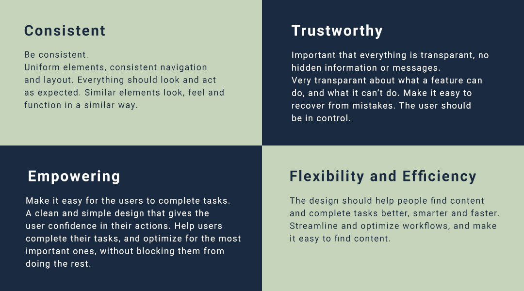
Guiding Goals and Principles
Design principles

Style Guide

Before starting on the style guide, I did some research by going through the Native Woodland Trust website. I was trying to figure out who they were, and what their mission was. And I also wanted to consider who their users are, so that I design with them in mind. 

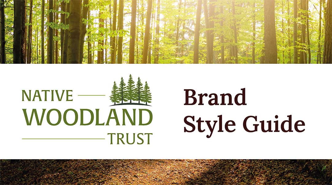
The style guide contains the logo, colors, typograhy and photograpy – as well as the do’s and don’ts.

Native_styleguide

The Logo

The logo is inspired by the forests, and I wanted it to be clean and simple but also elegant and organic. For this logo I used a elegant and slightly rounded, organic serif-font.

Versions of the logo

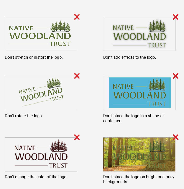
The rules of the logo

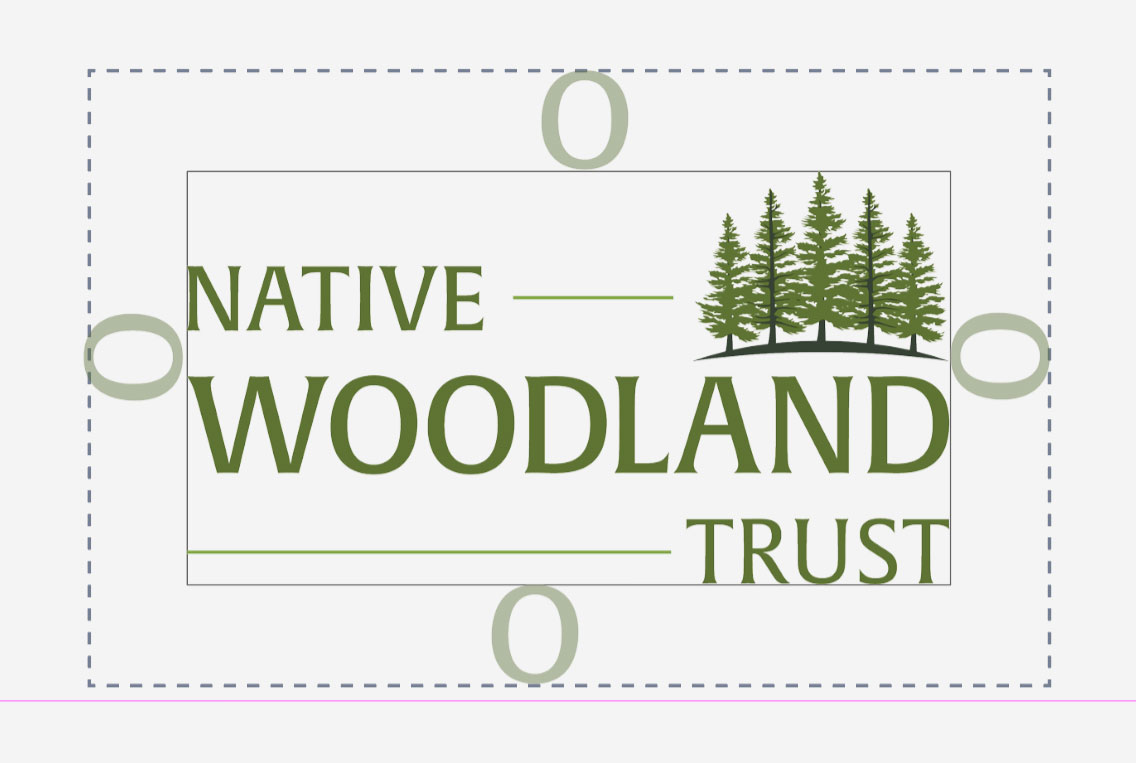
Clear space around the logo and aim for high contrast.
Logo space
Logo don't

The Colors

The color palette is inspired by the forests. Dark green hills meeting a blue sky.
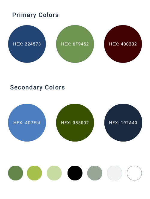
Color Palette

Typography

The main fonts are Lora and Roboto. Lora is used for headings and quotes, while Roboto is used for body text. It also gives a slight organic feel and flow. It is also well optimized for screens, and also works well on print.

Lora is a modern serif font that contains some very unique calligraphic elements. Roboto is a friendly and slightly geometric sans-serif font. It is modern, with a very natural flow. It provides a good contrast to Lora and is nice to read.
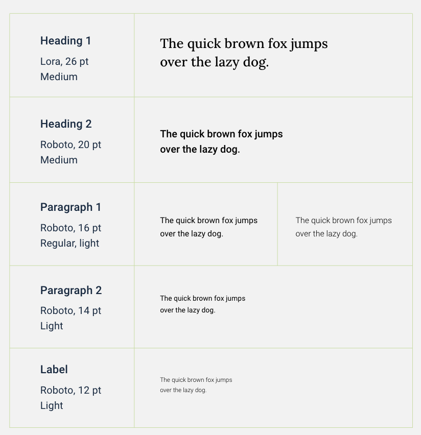
Typography

The story in photography

The photography should speak to people. It should feel intentional and fit the setting and text it accompanies. The photos should enhance the story/subject, connect with the audience and inspire them.

For this brand I chose to mainly use images of nature and animals. Snapshots of ecosystems, and flora and fauna with  harmonious colors and layout. Images in focus and in high resolution. Basically the photos should be vibrant and tell a story.

Image Style

See the complete Style Guide.

Wireframes

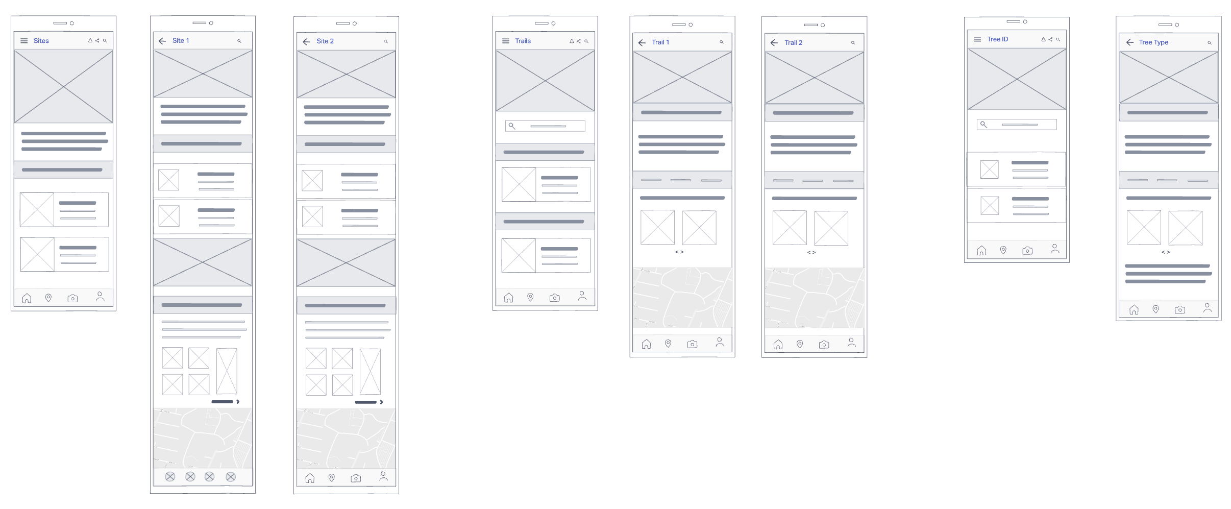
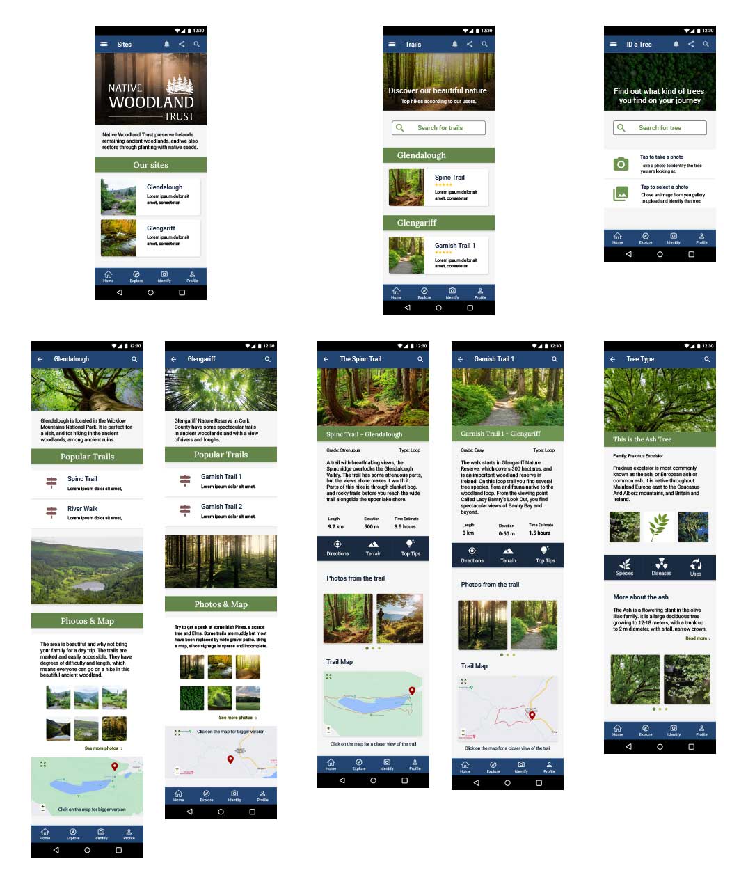
The second part of this project was creating an app for Android. The purpose of the app is to raise awareness about The Native Woodland Trust within Ireland. It gives the users an opportunity to find areas with trails for hiking and also a way to identify the trees they see.

Low-Fidelity Wireframe

Made InVision

Low-fidelity wireframes

High-Fidelity Wireframe

Made in Adobe XD

High-Fidelity wireframe

Test the Wireframes.

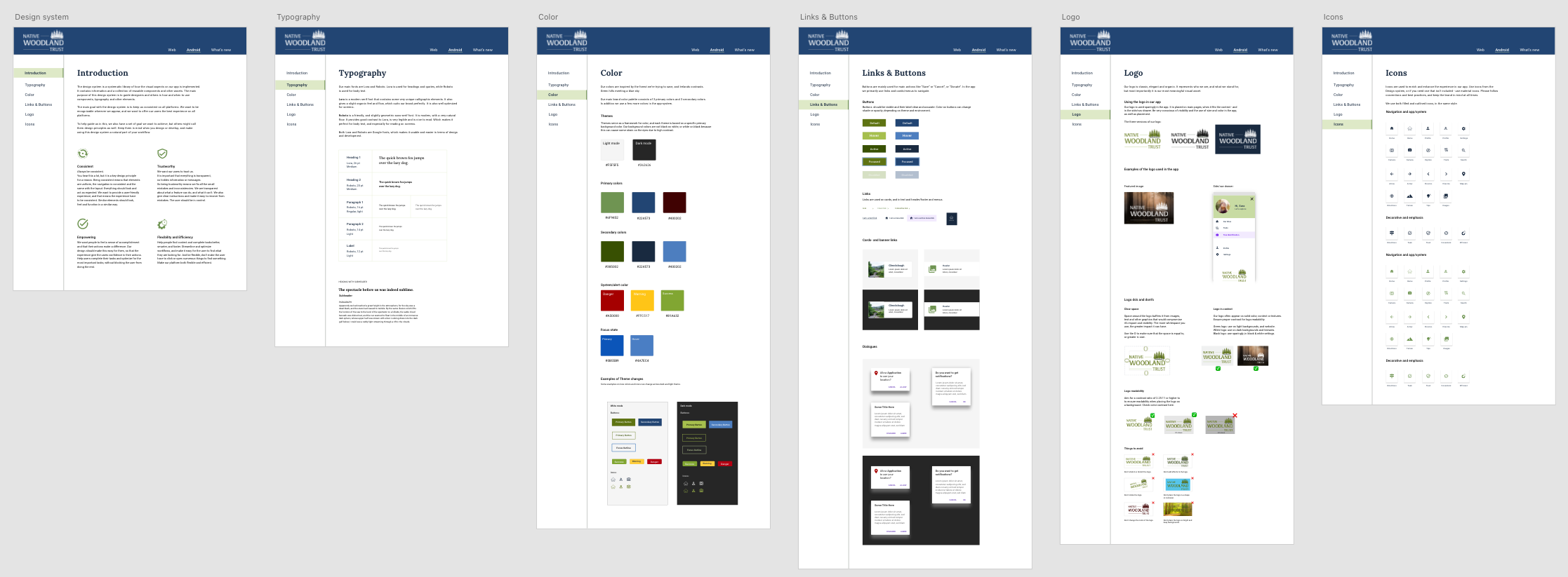
Design System

All elements and principles was put into system in a Design System. 

Design System

Testing

The final part wast testing the prototype. I planned and executed a usability test, and you can read the full report here.
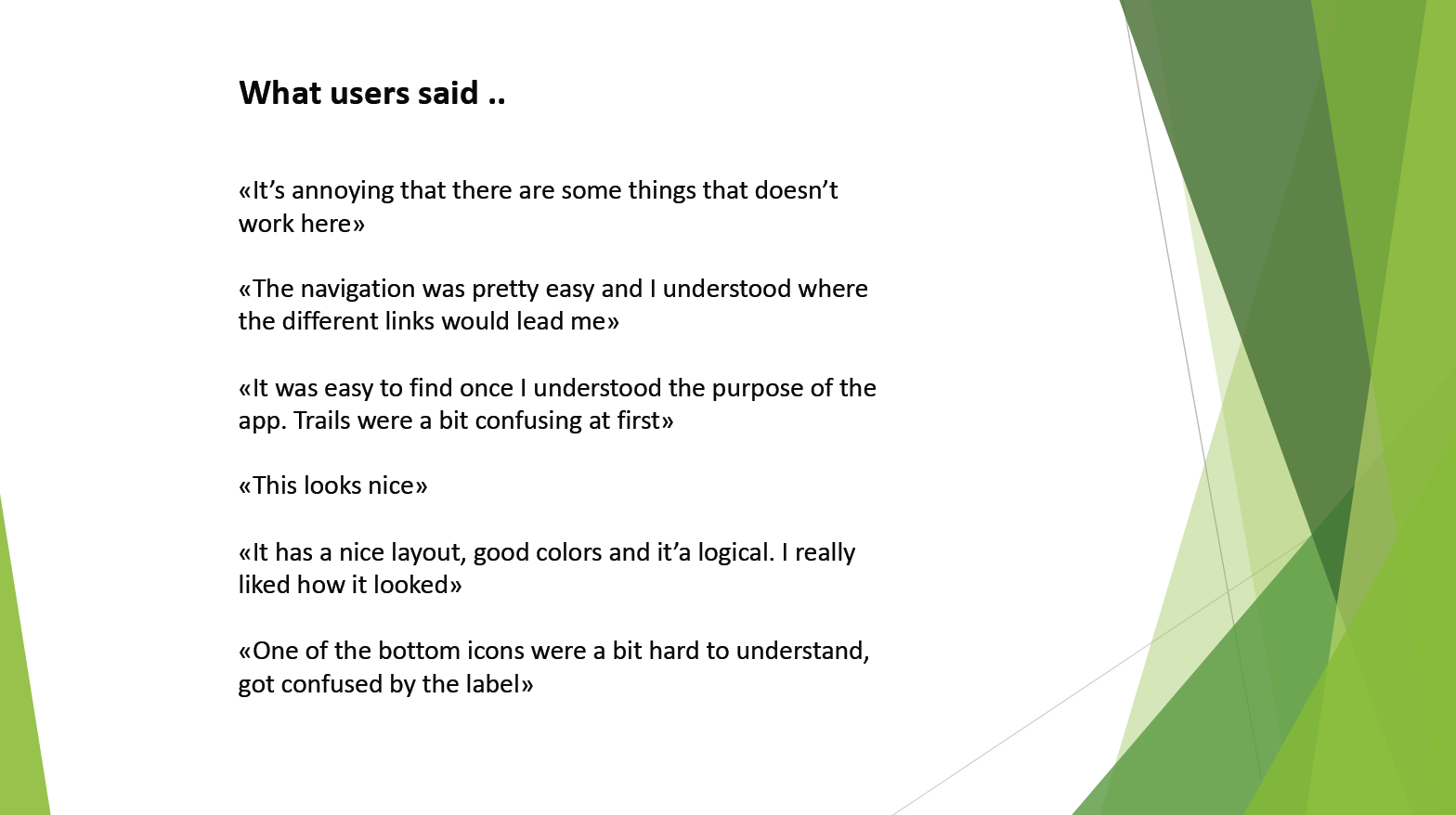
Usability test

Conclusion

From start to finish I have tried to keep a consistent look and feel from the style guide, through the wireframes and design system. The result from the usability testing indicates that I have managed to create an app that visually appeals, but that there were some points of confusion that needs to be improved. The testing provided good feedback, and gave me a clearer vision of the modifications I need to make and the iterations that are needed to improve the app/high-fidelity wireframe. I did not do any of the changes at this time. 

What’s next?

The next step is to iterate and make the changes to the issues pointed out by the testers – and then test again.
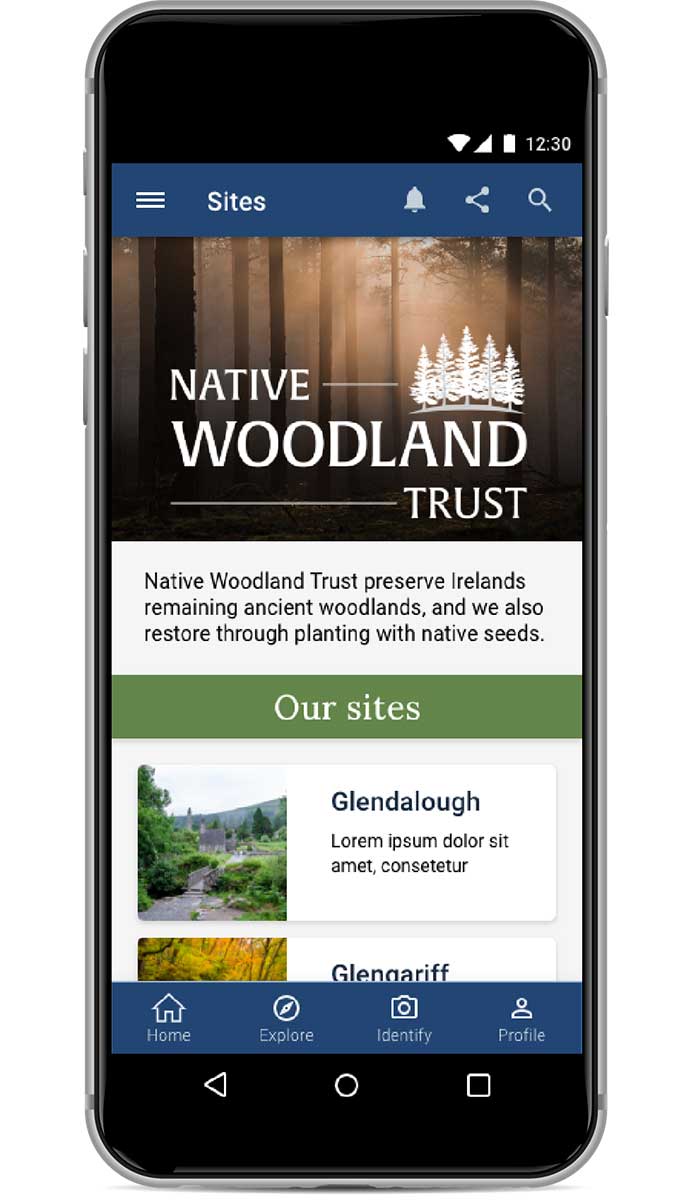
 

image of app

Thank you for reading!

case studies

Pictures of the wireframe for the app
Image of desert

Design Foundations: TreeLife

Design Foundations: TreeLife

The Brief

TreeLife knows that many people care about nature, want to protect the environment and fight climate change –especially its eco-conscious customers. TreeLife recognises the importance of tree planting as a natural climate solution but doesn’t necessarily have the knowledge or space to plant trees themselves.

The Objective

Design a four-page website for TreeLife’s initiative to educate people about planting trees.


The audience

TreeLife’s target audience is:
  • 50% male and 50% female
  • aged between 25 and 35
  • people who like spending time outside
  • people who value nature and their surroundings
  • people who strive to lead a more sustainable life.

Timeline

September 2021

Team

Terese Hansen

My role

UI Designer, researcher

Project

Course Assignment Noroff

Tools

Adobe XD
Photoshop
Illustrator
Airtable
Xtensio
Miro

Methodology

The Design Thinking approach was used to gain an empathic understanding of the people
we are designing for, and for the problem we are trying to solve.


Design thinking illustration

Reflect & Research

After reading the brief and other information several times as well as studied the problem statement – I started gathering my own information and thinking about the problem. One of the things I did was search for similar companies and brands that sell clothes or other items to reforest or rewild. I also searched for foundations that don’t necessarily sell stuff but is based on contributions (charity) for more information about the problem itself. Foundations are a good source for more quantitative data about reforestation. They often refer to research and studies done on the cause and effect of deforestation and planting trees around the world. Lastly, I tried to read more about sustainable living, to get a better understanding of what it means in practice.

While gathering more information (informal literature review) about the subject I also looked at the design and layout of the websites. I noticed that many of them use much of the same color-palette and much of the same layout. They also have a very similar tone of voice. My impression is also that a few of them have some usability issues in terms of too much informat ion, placed illogically and with little contrast. Many of the sites not written in English also struggle with the English translation, where some text is in English and other parts in French for instance.

Research illustration magnifying glass

Defining the idea

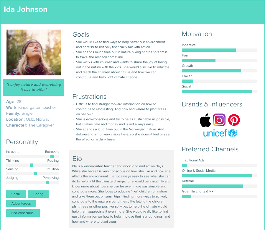
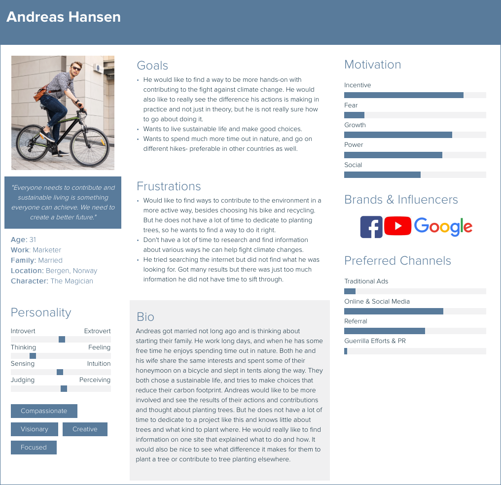
To really have a clear vision of t he target users, I created a persona profile to keep them firmly in mind and to better understand and feel empathy for the users. I made one female and one male based on t he information about the target users provided. Usually, a lot more work goes into making these – something I did not have time for on this assignment.

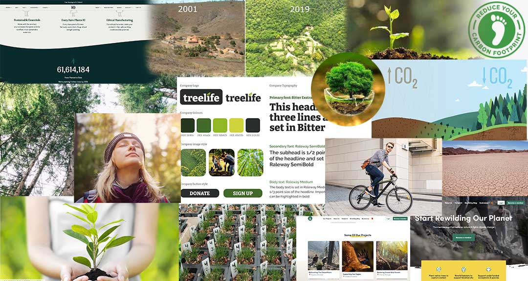
I also created a moodboard of sorts to keep my inspirat ion going while working on this. It helps me to stay focused on the direction I want to move in, and t he mood and message I want to express.

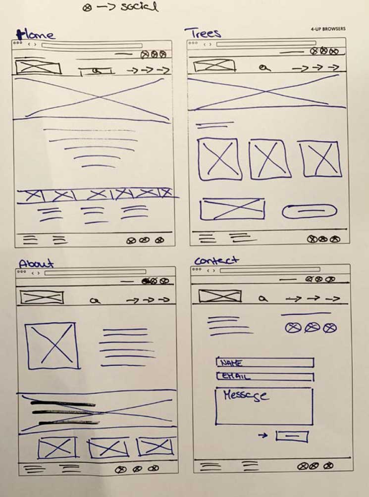
After research and defining the idea, I started to work on t he low-fidelity wireframes (sketches), and the goal was to make the pages tell a story.


Meet the personas:

TreeLife moodboard
Female persona
Male persona

Ideate & Low-Fidelity wireframes

TreeLife adresses a serious problem; We are in a critical climate crisis but I still wanted the visitor to get a positive and hopeful vibe when visiting. Because we can still do something, it’s not too late.

I also wanted the page to be organic, simple, informative and elegant, in order to get the visitor interested, learn about the project – and most of all to get them to plant a tree or to donate.

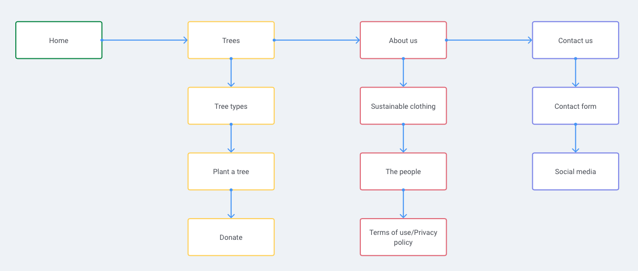
In order to visualize the build and hierarchy of the pages I made a very simple IA (in – formation architecture/UserFlow) and I also tried my hand at some low-fidelity, rough sketches.

Treelife sketches
IA TreeLife

High-Fidelity Wireframes

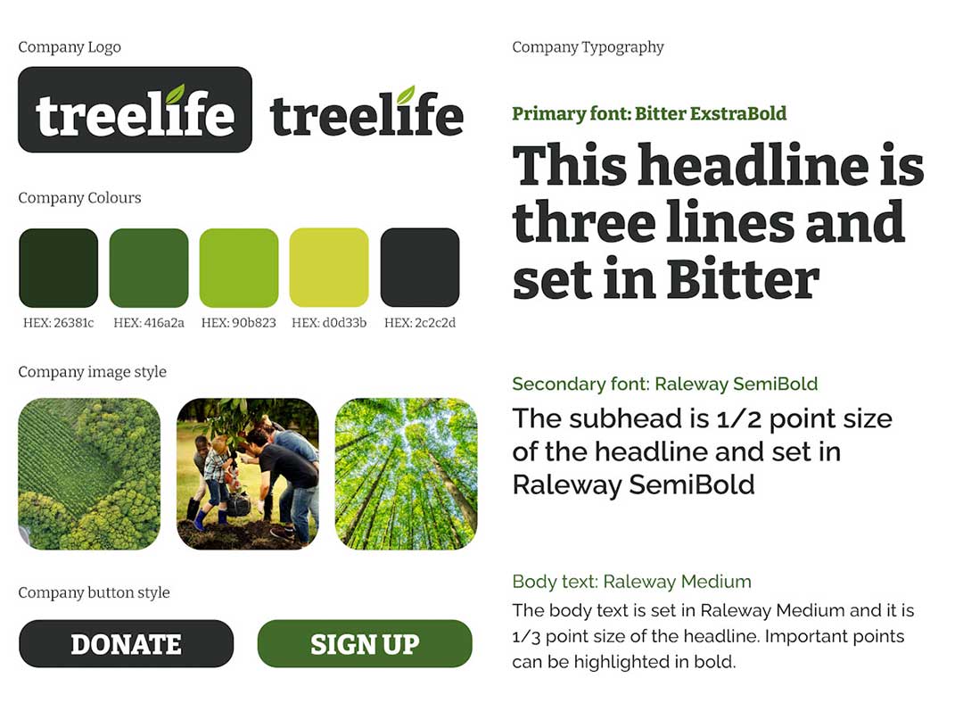
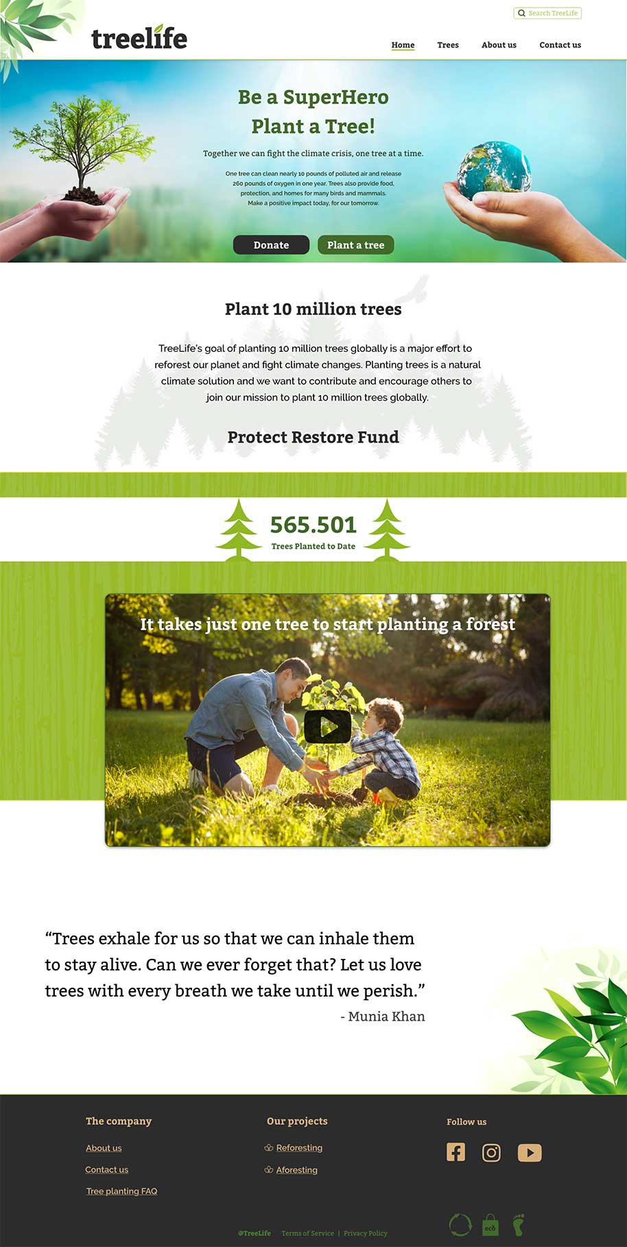
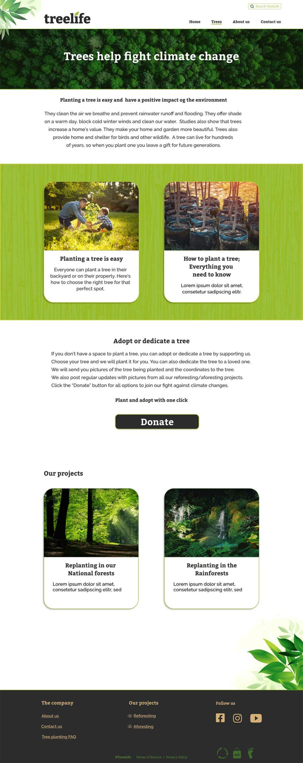
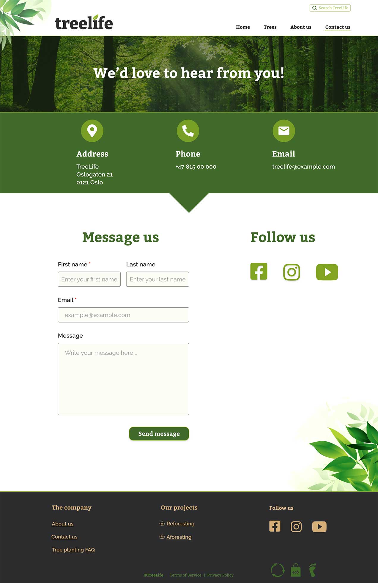
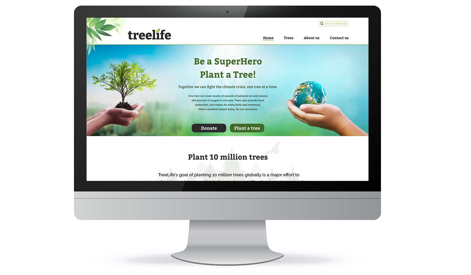
The page is mostly a three grid layout. All the important information is placed inside these three columns, and the layout is consistent and predictable. The colors and fonts are in acordance to the company graphic profile. Colors are used sparingly, mostly to emphasize or as an accent. The images fol low the tone of the company, and are used as navigation, to illustrate and tell a story. I’ve tried to focus on usability and visibility. I’ve made sure that the whitespace gives the users time to breathe, to separate different content and to create a logical flow in the design.

Some changes were made from the low-fidelity wireframes to the finished design, but the basic structure and idea is the same. 

TreeLife BrandGuide

The TreeLife brand guide.

The High-Fidelity Wireframes

Aboutpage
Homepage
Treepage
Contactpage
Treelife on screen

Conclusion

I tried to tell a story with the use of pictures, text, colors and consistent layout. I’ve tried to follow conventions, design rules/principles and also wcag 2.1 (accessibility/usability. While the design is finished for now, I do think that the pages need testing to find out if the text and navigation needs more work.

But overall I think that this design will engage the users and take them on a journey.


What’s next?

The next step would be to test the wireframes/prototype and then iterate until it is ready for launch.


Click the link to see the live wireframes.

Thank you for reading!
case studies

Pictures of the wireframe for the app
Image of desert

Brand Identity: Baristas

Brand Identity: Baristas

Overview

This task was about designing part of the brand identity for the coffee company Baristas. They are passionate about making coffee for their customers. In this assignment my job was to create a logo, color palette and typography.

THE AUDIENCE

They cater to a younger crowd of people who like a good cup of coffee and meeting up with friends.

My role

UI designer

September 2021

Tools

Photoshop
Illustrator
Adobe Indesign

THE PROJECT

This assignment was for my UI studies at Noroff.

Methodology

I always use the Design Thinking approach in some form to understand the problem and people’s needs, becuase this process is very user-centric and makes it a bit easier to organize the whole process and find effective solutions to the problem. Even on small assignments like this one, I use this approach.

Emphatize

Before starting the design process I need to understand both the client and the users. In this case that meant research. I researched other coffee houses – what their logo was like, colors and other elements. Then I looked at their users who are young, energetic and on the go. And I also played a bit in Adobe Color for inspiration to the color palette.

So with the brands’ attributes and the brand personality in mind, I started designing the logo.

Brand attributes:

Energetic, friendly, imaginative, youthful and modern


Brand personality:

Sincere – down to earth, honest, wholesome and cheerful
Exciting – daring, spirited, imaginative and up-to-date


Brand Guide


The logo

Because of the brands’ attributes and personality I pretty much excluded most vintage fonts and handwritten/calligrahy type fonts. But I still wanted the logo to visible in different sizes, clear and also timeless. So I leaned very little on trends and instead focused on robust fonts that could withstand time and also let the customers grow with the logo, instead of outgrowing it.

The font I ended up with for the brand name is a robust, elegant, stylized and versatile font with a nice flow. I adjusted the kerning and tracking and also resized some of the letters.

For the rest of the logo I wanted to avoid the traditional stamp- or banner logo. But I also wanted a graphic element that could stand on its own without the rest of the logo. I took coffeebeans and made them in different sizes and colors and placed them in a pattern almost like a flower. Combined with the almost masculine font, this should make the logo appeal to both male and female customers.

I also introduced another stylized fort for the “coffee house” in the logo to make it a bit fun and to keep a nice flow without it getting too rigid and tight.

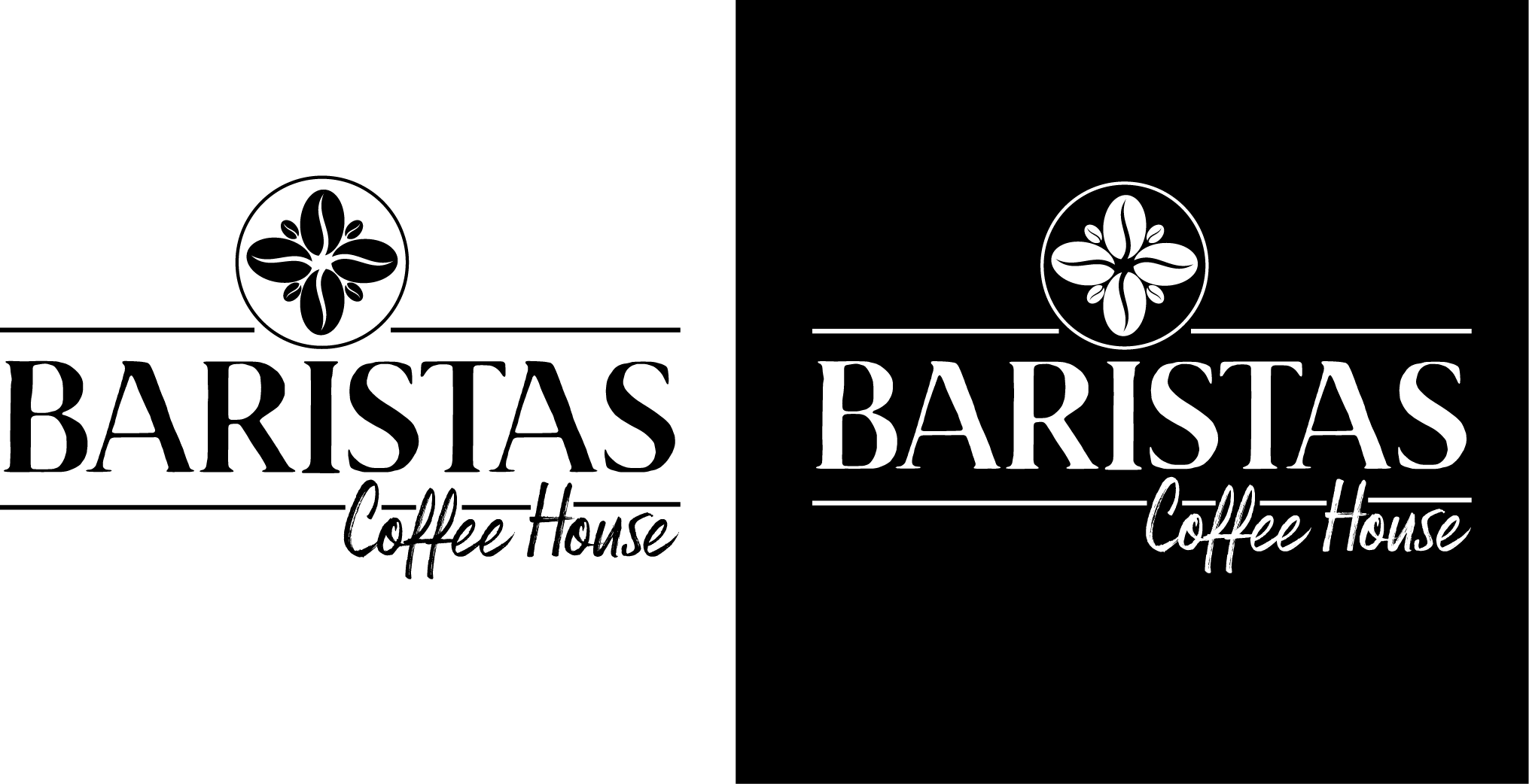
The logo and elements were first designed in black and white:

After some adjusting and resizing I started to look at colors. I wanted to use the different hues of coffee and cream/milk, since Barista is passionate about their trade – but I also wanted som contrast and keeping it a bit organic.

The logo can be scaled down quite a bit without losing quality – and there is also possibilities to use only parts of the logo for different purposes. I tried to design it so that every element can stand on its own.

The graphic coffee bean “flower” for instance can be nice to use on cups, windows etc.

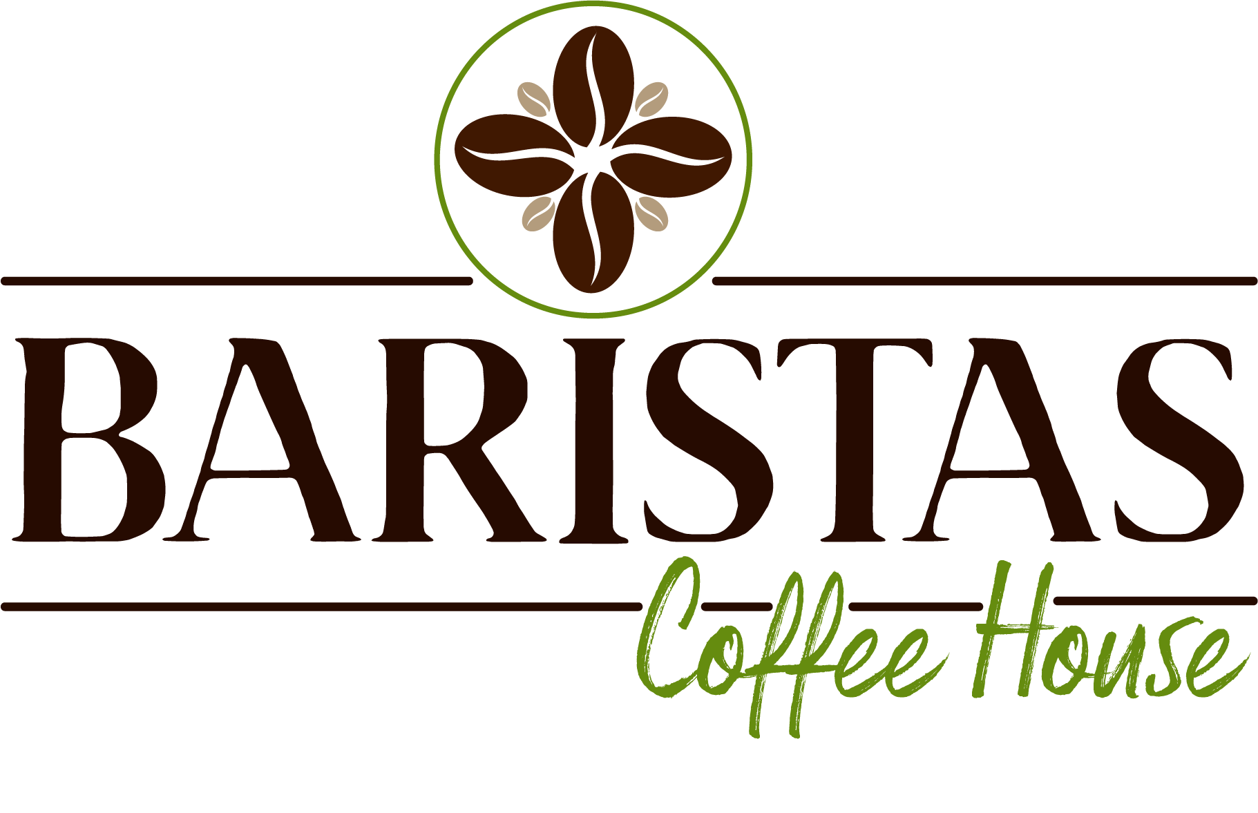
So after further adjustments and introducing colors, the logo looked like this:

Color and Typography

The main focus on this assignment was on the creation of logo, and that is also what inspired both the color palette and the typography.

Colors

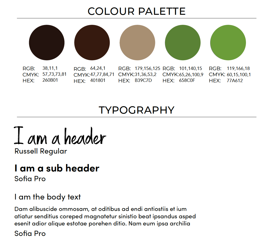
The main inspiration is taken from the coffee beans and leaves. The brown brings balance and a natural and organic feel while the green brings to mind health, growth and vitality. Together with the typefaces they should appeal to a “younger” crowd without being based on trends.

Fonts

For the fonts I decided to keep the stylized Russell font as a decorative header font. It will display nicely on printed effects like menus etc and also works well on a screen. The main logo font Brixton does not work as well as a header font and was discarded as such.

For the sub header and body I decided to go with a sans serif font that is very versatile and readable both in print and on screen. Sofia Pro also have a lot of styles (16) in the family and is designed with a higher x-hight which also makes it a very readable font. It’s a modern font that is rounded and has a very nice flow to it.

Since I chose a decorative and stylized header font, Sofia works as a complement and calms it down. Both fonts should also speak to the target since they in combination is both edgy and laid-back and inspires creativity.

Conclusion

General thoughts and learnings.

After finishing the logo, fonts and colors I feel that the combination fit the brands’ personality, while also appealing to their target group. The elements work well together, and can also be broken up and stand on their own – depending on what the use is.

While the design fit the brand’s personality, the colors and placement of the text and graphic elements also gives a nod to the traditional. Coffee after all have a long history and tradition, and it is a craft Baristas is proud of.

After submitting the assignment the feedback was good, but I was challenged on contrast.

The brown colors are very neutral and don’t have a lot of personality while the green brings in a fresh, youthful feel. So how would the logo loog like with the main word “Baristas” in the green and the sub words “coffee house” in brown?

The answer is this:

What’s next?

The next steps in this process would be to improve on the logo and flesh out the color palette and typgrahy and to create a complete brand style guide. In the end it should also be tested on the target audience, what are their feelings about the colors and design? That’s the most important question.

Thanks for reading!

Other case studies

Image of desert
Pictures of the wireframe for the app