Template Design

Template Design

I think the phrase I’ve heard, and said the most these last years are: “Be consistent!”.
And I think this is an important rule in any type of design, but most importantly in Interface Design.

Consistency is especially important because we as users already have a mental model and an expectation on where things should be placed, and how they should function. When there is a mismatch between the users mental model and the system/designs functionality we add to the users cognitive load and the user will not have a very good experience.

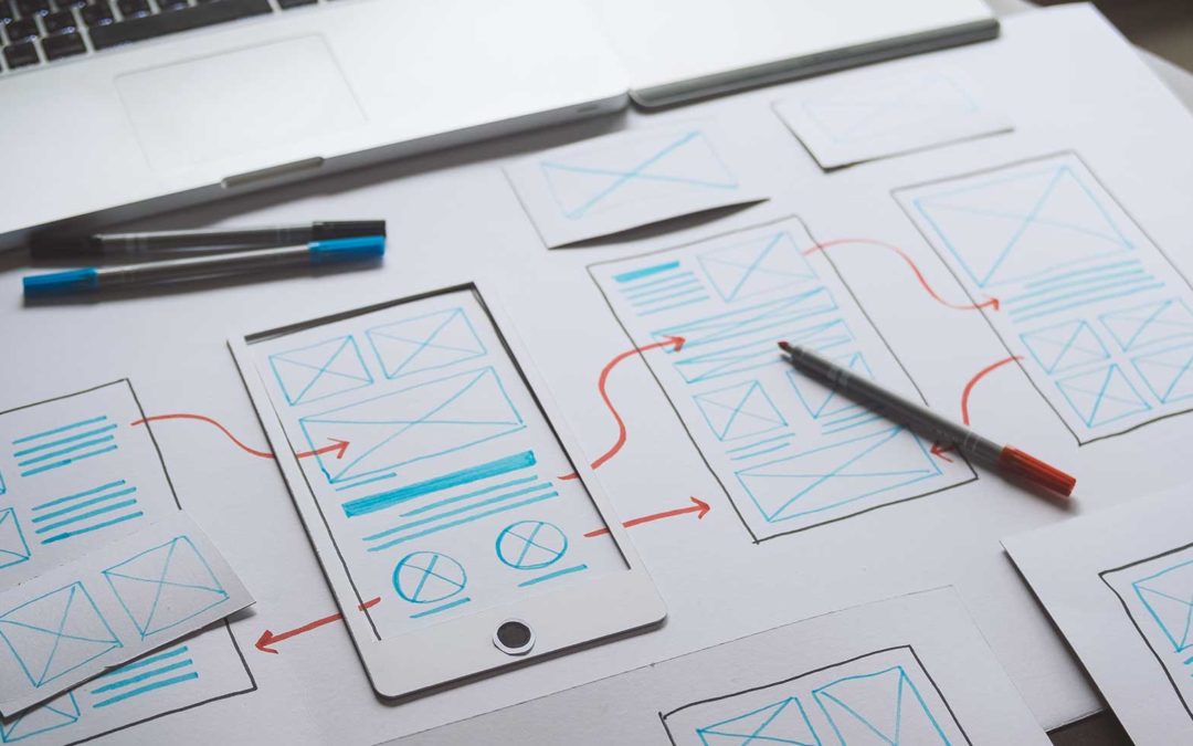
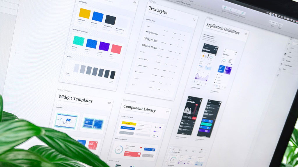
Templates are a great tool to ensure that we stay consistent at all times and across all platforms. They also make the life of a designer at bit easier, and speeds up the design process. Template design often uses the atomic design method to build the structure – atoms -> molecules -> organism -> template. You can read more about Atomic Design here.


So what are templates?

Templates are layouts of webpages or applications consisting of the complete page that designers can reuse. Templates includes brand elements like logos, images, buttons etc and the placement of these are already decided by the designer responsible for the design.

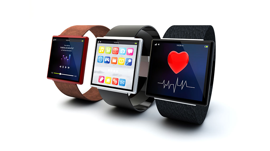
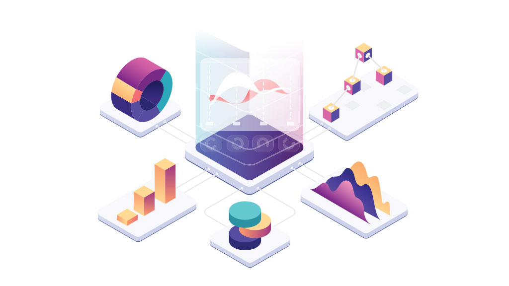
One example of using template design is a email newsletter. By using an existing email design template, the designer only has to worry about adding the content the business wants to share with the customers. Another example of template design is e-commerce and product pages. When you have hundreds or thousands of products you want displayed to potential customers, it doesn’t make sense to make a layout for each one – not to mention how time consuming that would be. Instead it makes sense to have one or two templates and only make small adjustments as needed. The last example I would like to mention is dashboards, which is another excellent example of template design. In a dashboard most information is presented in graphical form, and having to design all those elements can be very time consuming. So having a dashboard template, wouldn’t only save time, but also make us more effective and help us stay consistent.
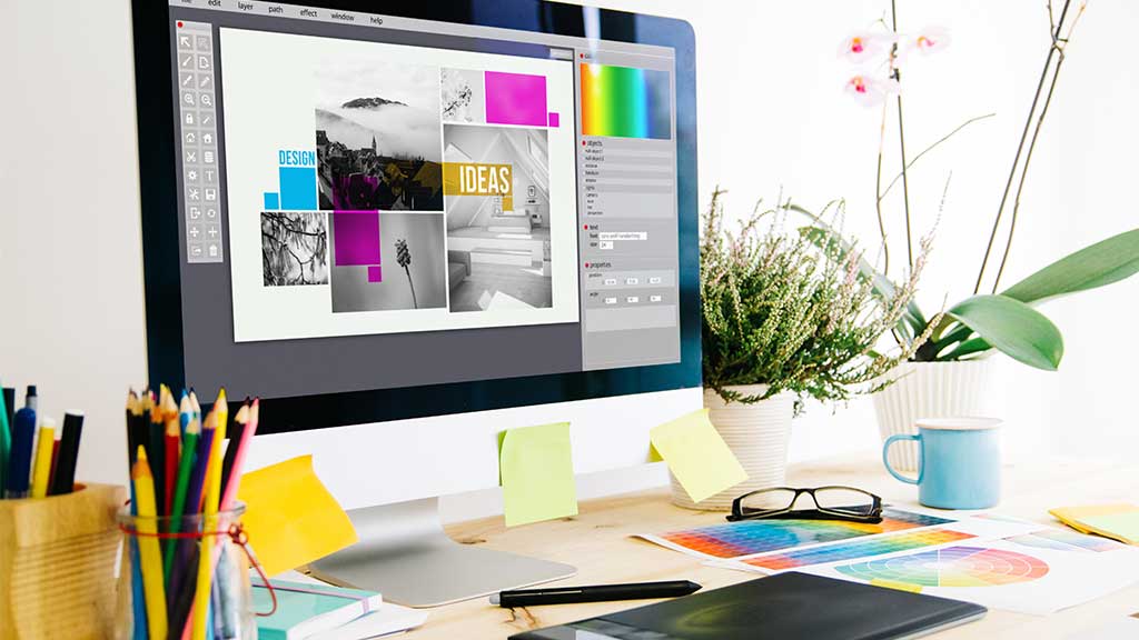
 

Example of template

As an example on how to use or make tempates I’ve included a quick module assignment I did a little while ago.

The assignment was to design an email and form template for WWF – Wildlife conservation. There were two requirements in this assignment:

1 – They need an emailer to go out to supporters to encourage them to donate.

2 – They need a fresh online form design to capture the information about the donation.

Before starting I visited the WWF website to get a feel for their identity and how they present themselves online. I wanted to incorporate as much as I could of their graphic profile and tone of voice.

I then started the process by making low-fidelity wireframes of both templates.

Email template

The email/newsletter should entice the users to click the call to action and go and donate on the WWF website. I tried to include the WWF branding with the logo and colors. I kept the call to action above the form, and to guide the eye towards the donate-button. I also wanted the text and images to evoke an emotional response, stay true to the cause and get donations. The template is pretty standard and by just changing the content it can be used again and again.

Donate page

I kept the same style and tone of voice to keep the connection between the email and the donation page. The main goal with the page was to make it easy to use, informative and effective in collecting donations – while also being visually appealing and evoking emotions. The donation blocks should be prominent, and the form should only include the necessary form – and payment fields. There is no need to gather more information, and long forms will only make it harder and more tedious to fill out. I’m hoping that donations would increase by making it as easy and appealing as possible

WWF newsletter template
Donation page template

Making and using templates can make a huge difference. It saves you both time and money, they ease your workload and are just plain easy to use. They also makes it easier for new designers that start a new job and they reduce errors. But most importantly it keeps your designs consistent.

Data Visualization

Data Visualization

Before we can think about how to visualise data, we need to understand what data is. 

Data can be statistics, facts and bits of information we gather that provides us with insights and knowledge. Data can also be qualitative or quantitative and are pieces of information that aren’t always numerical. 

Data visualizations can include data, data points, data metrics and show KPIs.

So, what’s the difference between data, data points, data metrics and KPIs?

Data – any collection of observations/facts can become data.

Data Point – is a single fact. It is a set of one or more measurements that gives values without any meaningful context. For example: Sale = $ 100 

Data Metric – A metric is a numerical measurement of something, and it’s a quantitative measurement of data. It’s the result of contextual measurement and summarization of data points. Examples of data metrics are: net profit (profit after expenses), number of customers per month, number of visitors to a website. 

KPIs (Key Performance Indicators) – A KPI is tied to a goal. It’s the goal the company wants to achieve and a value showing its ability to achieve its goals and objectives. You can have many metrics, but they are noe all equally important. The important metrics are KPIs.

And what is Data Visualization?

Presenting data visually has a long history, and the two biggest steps in showing information are maps (cartography) and science. Data visualization is the visual presentation of data using specific visual elements, it shows the data graphically and visually. 

Most of us are visual learners, and we remember a higher percentage of what we see than what we read. We deal with large data systems daily and so much information that we need a simple way of making sense of, and comprehending, large amounts of data. By visualizing the data we can turn it into a format that is easier to explore and consume.

With the help of visual charts, graphs and infographics, data and insights are shown in simple ways that we can easily understand. Just reading numbers, statistics and percentages in spreadsheets makes it hard to understand the data and see connections and results. 

Dashboard

Types of data visualization

Data Visualization often use different types of charts and graphs, and they all show data but in different ways. It’s important to choose the right kind of graph or chart relevant to the data you want to show. Data visualization can include visual elements like charts, maps, graphs, tables and infographics.


Data Storytelling

Why not go further and include storytelling? Presenting data visually will certainly tell you what is happening, but it doesn’t tell you why. Creating a narrative around sets of data with visualizations will establish a story for the audience viewing the data. It creates the context needed to explain why something has happened and gives your data a voice – your data have a story to tell after all.

What to consider when visualizing data

Research and preparation is everything when it comes to visualizing data:

– Know what you want to communicate
Before creating the visualization, think about what it’s for. What is the purpose and goal of the visualization?

– Communicate the truth and be clear
Visualization should be based on good data so make sure that the data is accurate. People should be able to trust that your visualizations convey only reliable information. The graphs, text and layout should also be clear and easy to understand.

– Show just the right amount of data
The visualization should show the right amount of relevant data. Try not to either oversimplify or make it too complicated. 

– Know your audience
It’s important to know the user, and find the right type of visualization for your target audience. What challenges does you target audience face and which questions will they try to answer with data visualizations. What decisions will they make based on this data and why?

Choose graphs and charts that show statistics relevant to what your audience needs to know. All data visualizations should align with the user’s expertise and knowledge, and use simple and easy to understand language.

Conclusion

Data visualization is an effective graphical way of showing data or telling a story, and we have the tools to create visualizations with little effort. But we should keep in mind that every design choice we make should enhance our user’s experience – not our own.

Sources:

Noroff
Adobe – XD Ideas
Nugit

Design Systems – What are they?

Design Systems – What are they?

A design system is a systematic library of how the visual aspects of a product is implemented. And it contains a collection of reusable components, code snippets and other assets. It also explains and guides the designer in how and when to use them.

A design system is a set of deliverables that will constantly grow and evolve with the product. Using a design system helps us maintain consistency and design faster. In the end we want to create the best experience possible for our customers, and design systems helps us achieve this.

It’s easy to confuse style guide and pattern library with design systems. But style guides and pattern libraries are actually a part of the design system. Think of the design system as the big umbrealla that covers everything.


A design system is:
  • The source of truth that eliminates confusion and conflict
  • Makes sure we are consistent on all platforms
  • Lighter, faster loading products
  • Faster design process
  • Quicker development and testing
  • Reduction in design debt when scaling up


So what do we include in a design system?

Imagine every part of an interface visually, and ask yourself: What makes up the product? What does it consist of?

A brand is most often based on certain principles, and they can be described as the look and feel of their product. Their design, or interface, often represents these principles but aren’t really visible. Instead they are expressed visually. These principles are often included in a design system.


Other things common design systems include sections on:
  • Guiding principles
  • Imagery and media (logo, photo, illustrations, icons, diagrams, sounds, video, animations etc)
  • Color
  • Navigation
  • Spacing
  • Copy
  • Typography
  • Accessibility

Typically how big or small, complex or simple, a design system is, depends on the product.


8 design systems to look to for inspiration:


Google Material Design

Material is a design system created by Google to help teams build high-quality digital experiences for Android, iOS , Flutter, and the web.

Apple Human Interface Guidelines

Get in-depth information and UI resources for designing great apps that integrate seamlessly with Apple platforms.

Shopify Polaris Design System

Our design system helps us work together to build a great experience for all of Shopify´s merchants.

Microsoft Fluent Design System

Fluent is an open-source, cross-platform design system that gives designers and developers the frameworks they need to create engaging product experiences – accessibility, internationalization, and performance included.

Carbon Design System

Carbon is IBM’s open source design system for products and digital experiences. With the IBM Design Language as its foundation, the system consists of working code, design tools and resources, human interface guidelines, and a vibrant community of contributors.

Mailchimp’s Design System

Mailchimp help millions of customers around the world grow in their own way. We want to show our customers that building successful business means staying true to yourself. With this brand identity and design system, we hope to inspire them to be bold and creative with their own brands.

Salesforce Lightning Design System

Salesforce Lightning Design System is flexible, scalable, efficient, accessible and living. Its purpose is to improve marketing, commerce, IT, service and sales efforts and allows their users to do the same.

Atlassian Design System

Design, develop, deliver – Use Atlassian’s end-to-end design language to create simple, intuitive and beautiful experiences.

SkySmart – A booking app

SkySmart – A booking app

Many of us use apps to book flights, and if we don’t use them for the booking itself we often use them to keep track of our tickets and to get relevant updates and offers. In this assignment the goal was to design a mobile app for iPhone that also works on a smartwatch (watchOS). In other words, two apps for the same fictive company, SkySmart.

The main objective was to create an app that worked seamlessly and in tandem og both devices. This was done by following the design thinking process, and considering the content first.


How should the SkySmart-app work?

The mobile app:

  •  Search and find suitable flights
  •  Choose the flight
  • Enter personal details for the flight (name, passport, number, email)
  •  Choose seat on the plane
  •  Pay for flight (enter credit card/payment details)

The smartwatch app:

  • View the flight departure date and time
  • Check the flight number
  • View the flight departure and destination cities
  • See the flight duration
  • Monitor the flight status (on time, delayed, cancelled)
  • Access boarding pass

Even though this was not a case study, I sort of followed the Design thinking process, but the product did not go into high-fidelity wireframes or testing.

Getting started

I had already conducted research on smartwatches previously, and while this research was done with a fitness app in mind – it is not a big leap to apply this research to other areas where the need is similar.

From this research some of the favorite features was mentioned to be:
– Availability and getting notifications without disturbing others.
– Keeping track of goals and activities.

One of my questions about the user (research question) was:
– How and where would the user use the mobile/watch app – in which context?

I based my persona and scenarios on that previous research and what I think is the users goals, needs and frustrations. Research was also a continuous process during this task (literature review, competitor analysis).


Sketches and Low-Fidelity Wireframes

Before starting on sketches and wireframes I looked at other travel apps to see how they had solved certain, issues and to see what the best practices seemed to be.

The main purpose of the mobile app is to allow the user to search for flights, book them and allow for basic travel admin.

The main purpose of the Watch-app is to allow the user to see the most important information about their travel at a glance, to keep track of all their flight details and receive important notifications.

User Flow

The starting point for my customer journey for the SkySmart app is based on a signed-in user opening the app, and starting from the homescreen.

SkySmart User Flow

Low-fidelity Wireframes

The SkySmart app is thought to function on iPhone and WatchOS.

The pages and patterns follow a pretty standard set of rules and guides to provide and easy and fast way to search for flights. It also gives the user a way to manage and find previous and current bookings fast and easy on the go.

Skysmart Low Fidelity app

WatchOS low-fidelity wireframe

The thought when designing this app was that it should give the user information in a easy and fast way. It should tell the user what they want to know at a glance. So it should be fast and easy. Since the screen is so small, there is no easy way to give a lot of information – that is what the phone app is for.

(I know this more of a mid/high-fidelity wireframe, but I got a bit carried away)

SkySmart WatchOS
SkySmart WatchOS

Mid-fidelity Wireframes

Before starting on my mid-fidelity wireframes I went back over my research and also continued my search of other apps to find the most common patterns and how others have solved the usability issues with booking on small screens.

For the mobile app I went for a blue-ish color as the main color in reference to the company name – SkySmart – in addition to Apples recommended system colors for text and background.

For the SmartWatch I used Apple complications and the colorscheme from the Human Interface Guidelines. When going in to High-fidelity one can add SkySmart blue to the app as an accent color. Since this one went straight to mid-fidelity instead of low, I iterated on my design and made some changes and corrections.

Skysmart app medium fidelity wireframe
SkySmart WatchOS medium

More iteration is needed as the SkySmart apps move from mid-fidelity to high-fidelity. And of course the apps should be tested by real users to make sure they function as intended and solve the users needs.

The importance of good UI design

The importance of good UI design

A digital age

These days almost everything happens online. We read our news online, we do much of our shopping online and we meet and interact with many of our friends online. We also do our research online. Buying a new car? search online. Need a new vacuum? search online. Want to go to a restaurant? turn on geolocation and see what’s near you, with reviews. We put our trust in ratings and customer reviews, and in many cases these are what determines what product we buy or where we go out to eat.

Our digital habits means that it is important that businesses have a strong online presence, but just being there is not enough.


Good UI

Visual storytelling is a great way to connect with your audience, and can be achieved with good UI. It helps create a user-friendly interface that can build the customers confidence and reduces confusion. It gives the business an opportunity to answer frequently asked questions, and address their customers’ pain points. Credability can be established with good UI and will more than likely convert users into paying customers and get them to return. Returning customers can become brand advocates as they spread the brands’ message to their other potential customers.


But what does “good UI” mean, exactly?

Good design should be simple and straightforward and it is not only about attractive visuals and elements. UI should in fact be nearly invisible, so that it doesn’t overwhelm the user with too many colors, crazy fonts, animations and other design elements. It should clearly broadcast the right message to the user, and meet both their needs and wants.

Each element in the design should serve a purpose, and most importantly – be consistent. Consistency ensures that the user quicly learn how to interact with your website/product, which in turn increases their confidence and makes their journey towards their goal more effortless and time-consuming.


10 principles of good design

Dieter Rams’ is a German industrial designer and has been involved in design for seven decades. He has recieved many honorary titles through his career, and his 10 principles of good design can be applied to any design.
After all, design is design.


Good design …

.. is Innovative
.. must be Useful (makes a product useful)
.. is Aesthetic
.. makes a product Understandable
.. is Unobtrusive
.. is Honest
.. is Long-lasting
.. is Consistent in every detail/thorough down to the last detail
.. is Environmentally friendly
.. is as Little Design as possible

The difference between UX and UI Design

The difference between UX and UI Design

Ever since I started immersing myself in everything UX, I heard and saw the terms “UX-design” and “UI-design” being used on the same things or talked about in the same sentence. Or so it seemed to me. I found this a bit confusing when I read case studies or searched the web for UX-related content, so I decided to dive a bit deeper to find the similarities and differences between the two.

What’s what?

UX design stands for “User Experience Design” while UI stands for “User Interface Design”. Both are important and work closely toghether – but the roles they play are very different.

User experience design, or UX, is a human-first way of designing products and encompasses all interactions and “aspects of the end-users interaction with the company, it’s services and products” (Don Norman).  In UX, a pain point, a user need or problem is identified and researched, then a rough prototype/wireframe is created and validated/invalidated through testing. Most often the Design Thinking Process is followed, and the steps are: Empathize, Define, Ideate, Prototype and Test. The Design Thinking process is iterative and it is common to go back and forth through the steps until the goals are reached.

User Interface Design, or UI, is a human-first approach to designing an aesthetically pleasing product. It can be the visual design of a website for instance and how the users interact with the site. “Visual” is the look and feel of the product and “interaction design” is the way the user interact with the product. Unlike UX, User Interface Design is a strictly digital term, and is the point of interaction between the user and a digital device or product. UI considers the look, feel and interactivity of a product and will think about things like icons, buttons, typograhy, colors, spacing imagry and responsive design (Careerfoundry).

UX makes interfaces useful. UI makes interfaces beautiful.

In terms of a digital product like a website, people go there with a goal in mind and to do stuff. A UX designer might look at the target audience and figure out what’s important to them and what they value. To figure this out, they ask questions, observe users, interview and make prototypes and test to see if they can validate their assumptions about the users and their goals.

Next, a UI designer might look at the personality of the website. The design, use of colors and other interactions. What kind of personality does the website have? Does it allow people to do stuff? How is the content presented and does it draw people in? It’s about positive emotions and making those personal connections and getting people hooked.

“User Experience (UX) and User Interface (UI) are some of the most confused and misused terms in our field. A UI without UX is like a painter slapping paint onto a canvas without thought; while UX without UI is like the frame of a sculpture with no paper mache on it. A great product experience starts with UX followed by UI. Both are essential for the product’s success” – Rahul Varshney.

Wrap-Up

While being two very different things, UX and UI also have many things in common. I’ve seen that many take on both roles, or companies advertise UX and UI as a single role. While it is possible (and fun) to work with both UX and UI, I think it is important to keep clear boundaries between the two since they require different skills and methods. Even if you have the skills and knowledge, it can make the design process less focused and switching back and forth between the conceptual phase and implementation can cause us to miss important parts of a design.

UX Designer

✔️ Conducts research
✔️ Identifies needs
✔️ Creates taskflows and prototypes
✔️ Focus on the full experience
      from the user’s first contact to last

UI Designer

✔️ Compose layouts
✔️ Create visuals
✔️ Build mockups
✔️ Focus on creating visual touchpoints
      that allows the user’s to interact with
      a product