Template Design
I think the phrase I’ve heard, and said the most these last years are: “Be consistent!”.
And I think this is an important rule in any type of design, but most importantly in Interface Design.
Consistency is especially important because we as users already have a mental model and an expectation on where things should be placed, and how they should function. When there is a mismatch between the users mental model and the system/designs functionality we add to the users cognitive load and the user will not have a very good experience.
Templates are a great tool to ensure that we stay consistent at all times and across all platforms. They also make the life of a designer at bit easier, and speeds up the design process. Template design often uses the atomic design method to build the structure – atoms -> molecules -> organism -> template. You can read more about Atomic Design here.
So what are templates?
Templates are layouts of webpages or applications consisting of the complete page that designers can reuse. Templates includes brand elements like logos, images, buttons etc and the placement of these are already decided by the designer responsible for the design.
One example of using template design is a email newsletter. By using an existing email design template, the designer only has to worry about adding the content the business wants to share with the customers. Another example of template design is e-commerce and product pages. When you have hundreds or thousands of products you want displayed to potential customers, it doesn’t make sense to make a layout for each one – not to mention how time consuming that would be. Instead it makes sense to have one or two templates and only make small adjustments as needed. The last example I would like to mention is dashboards, which is another excellent example of template design. In a dashboard most information is presented in graphical form, and having to design all those elements can be very time consuming. So having a dashboard template, wouldn’t only save time, but also make us more effective and help us stay consistent.
Example of template
As an example on how to use or make tempates I’ve included a quick module assignment I did a little while ago.
The assignment was to design an email and form template for WWF – Wildlife conservation. There were two requirements in this assignment:
1 – They need an emailer to go out to supporters to encourage them to donate.
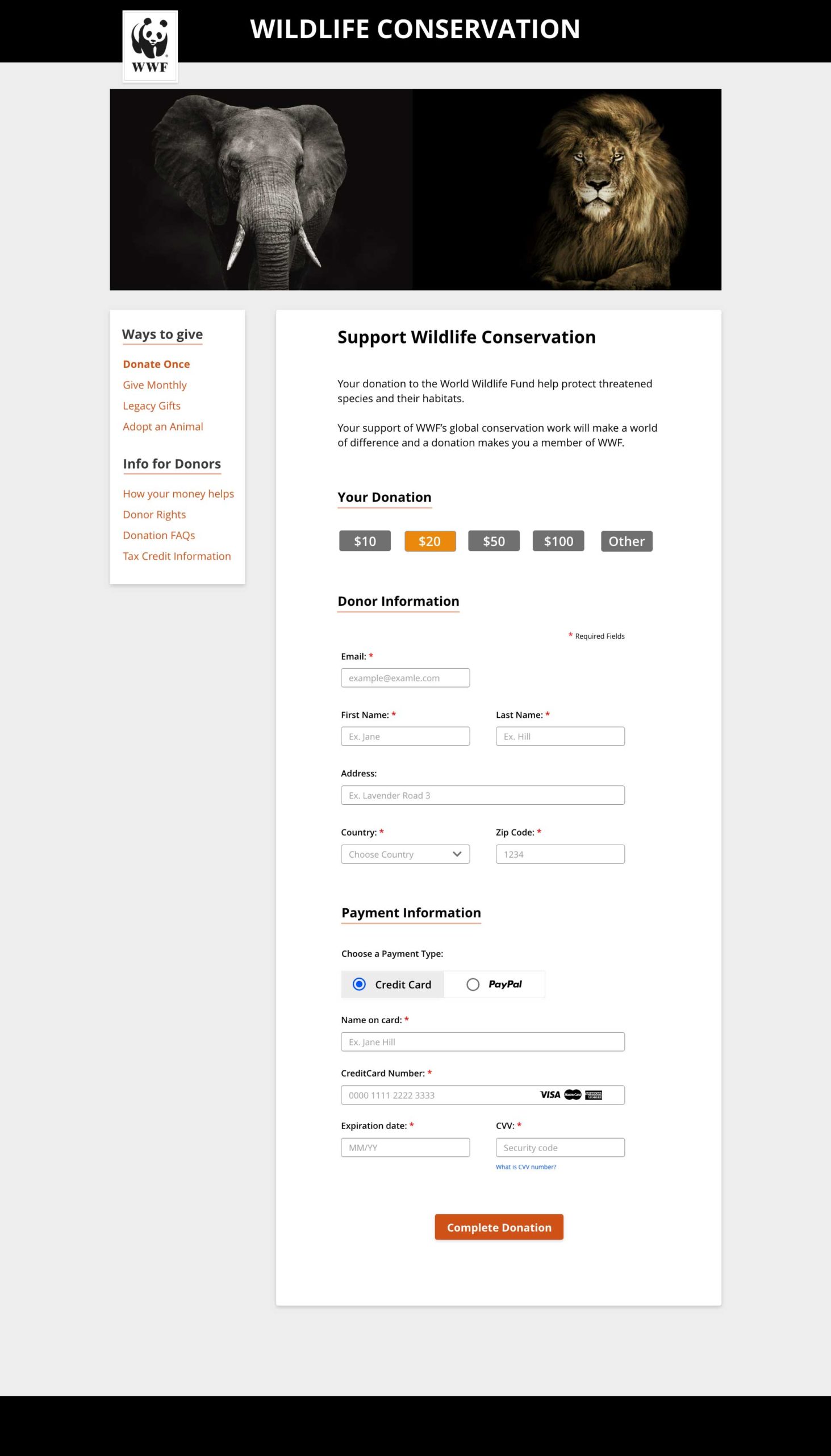
2 – They need a fresh online form design to capture the information about the donation.
Before starting I visited the WWF website to get a feel for their identity and how they present themselves online. I wanted to incorporate as much as I could of their graphic profile and tone of voice.
I then started the process by making low-fidelity wireframes of both templates.
Email template
The email/newsletter should entice the users to click the call to action and go and donate on the WWF website. I tried to include the WWF branding with the logo and colors. I kept the call to action above the form, and to guide the eye towards the donate-button. I also wanted the text and images to evoke an emotional response, stay true to the cause and get donations. The template is pretty standard and by just changing the content it can be used again and again.
Donate page
I kept the same style and tone of voice to keep the connection between the email and the donation page. The main goal with the page was to make it easy to use, informative and effective in collecting donations – while also being visually appealing and evoking emotions. The donation blocks should be prominent, and the form should only include the necessary form – and payment fields. There is no need to gather more information, and long forms will only make it harder and more tedious to fill out. I’m hoping that donations would increase by making it as easy and appealing as possible
Making and using templates can make a huge difference. It saves you both time and money, they ease your workload and are just plain easy to use. They also makes it easier for new designers that start a new job and they reduce errors. But most importantly it keeps your designs consistent.


