Brand Identity: Baristas
Overview
This task was about designing part of the brand identity for the coffee company Baristas. They are passionate about making coffee for their customers. In this assignment my job was to create a logo, color palette and typography.
THE AUDIENCE
They cater to a younger crowd of people who like a good cup of coffee and meeting up with friends.
My role
UI designer
September 2021
Tools
Photoshop
Illustrator
Adobe Indesign
THE PROJECT
This assignment was for my UI studies at Noroff.
Methodology
I always use the Design Thinking approach in some form to understand the problem and people’s needs, becuase this process is very user-centric and makes it a bit easier to organize the whole process and find effective solutions to the problem. Even on small assignments like this one, I use this approach.
Emphatize
Before starting the design process I need to understand both the client and the users. In this case that meant research. I researched other coffee houses – what their logo was like, colors and other elements. Then I looked at their users who are young, energetic and on the go. And I also played a bit in Adobe Color for inspiration to the color palette.
So with the brands’ attributes and the brand personality in mind, I started designing the logo.
Brand attributes:
Energetic, friendly, imaginative, youthful and modern
Brand personality:
Sincere – down to earth, honest, wholesome and cheerful
Exciting – daring, spirited, imaginative and up-to-date
Brand Guide
The logo
Because of the brands’ attributes and personality I pretty much excluded most vintage fonts and handwritten/calligrahy type fonts. But I still wanted the logo to visible in different sizes, clear and also timeless. So I leaned very little on trends and instead focused on robust fonts that could withstand time and also let the customers grow with the logo, instead of outgrowing it.
The font I ended up with for the brand name is a robust, elegant, stylized and versatile font with a nice flow. I adjusted the kerning and tracking and also resized some of the letters.
For the rest of the logo I wanted to avoid the traditional stamp- or banner logo. But I also wanted a graphic element that could stand on its own without the rest of the logo. I took coffeebeans and made them in different sizes and colors and placed them in a pattern almost like a flower. Combined with the almost masculine font, this should make the logo appeal to both male and female customers.
I also introduced another stylized fort for the “coffee house” in the logo to make it a bit fun and to keep a nice flow without it getting too rigid and tight.
The logo and elements were first designed in black and white:
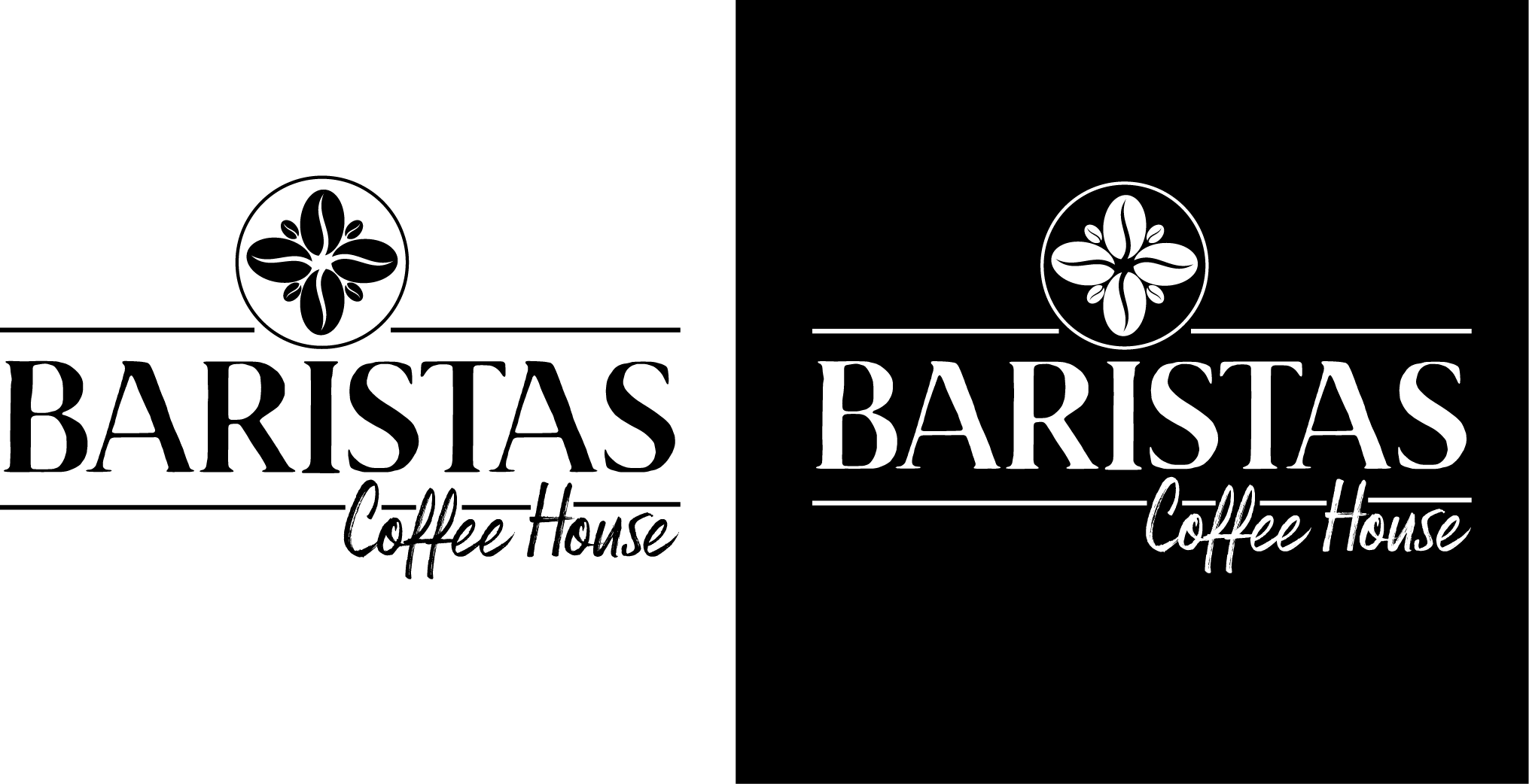
After some adjusting and resizing I started to look at colors. I wanted to use the different hues of coffee and cream/milk, since Barista is passionate about their trade – but I also wanted som contrast and keeping it a bit organic.
The logo can be scaled down quite a bit without losing quality – and there is also possibilities to use only parts of the logo for different purposes. I tried to design it so that every element can stand on its own.
The graphic coffee bean “flower” for instance can be nice to use on cups, windows etc.
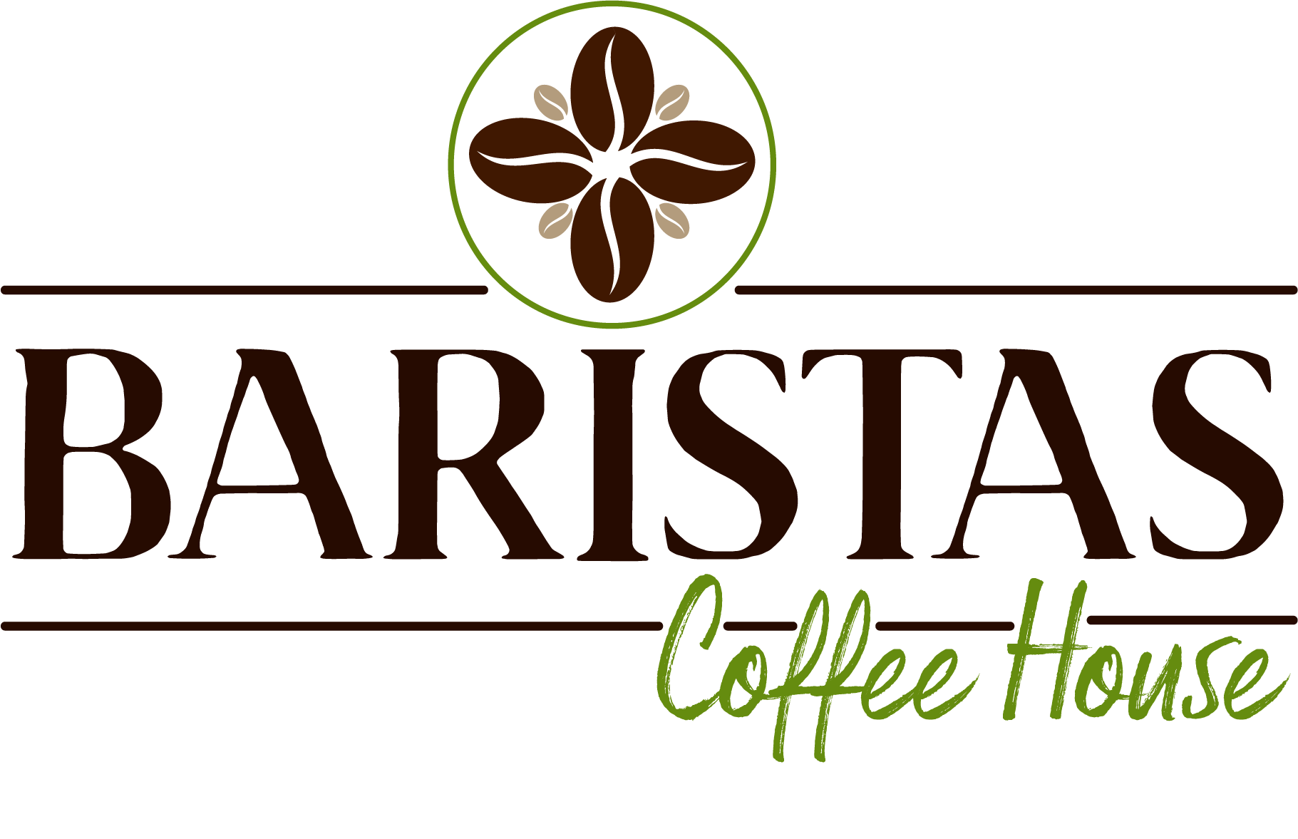
So after further adjustments and introducing colors, the logo looked like this:

Color and Typography
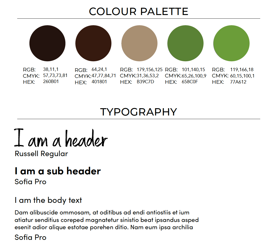
The main focus on this assignment was on the creation of logo, and that is also what inspired both the color palette and the typography.
Colors
The main inspiration is taken from the coffee beans and leaves. The brown brings balance and a natural and organic feel while the green brings to mind health, growth and vitality. Together with the typefaces they should appeal to a “younger” crowd without being based on trends.
Fonts
For the fonts I decided to keep the stylized Russell font as a decorative header font. It will display nicely on printed effects like menus etc and also works well on a screen. The main logo font Brixton does not work as well as a header font and was discarded as such.
For the sub header and body I decided to go with a sans serif font that is very versatile and readable both in print and on screen. Sofia Pro also have a lot of styles (16) in the family and is designed with a higher x-hight which also makes it a very readable font. It’s a modern font that is rounded and has a very nice flow to it.
Since I chose a decorative and stylized header font, Sofia works as a complement and calms it down. Both fonts should also speak to the target since they in combination is both edgy and laid-back and inspires creativity.
Conclusion
General thoughts and learnings.
After finishing the logo, fonts and colors I feel that the combination fit the brands’ personality, while also appealing to their target group. The elements work well together, and can also be broken up and stand on their own – depending on what the use is.
While the design fit the brand’s personality, the colors and placement of the text and graphic elements also gives a nod to the traditional. Coffee after all have a long history and tradition, and it is a craft Baristas is proud of.
After submitting the assignment the feedback was good, but I was challenged on contrast.
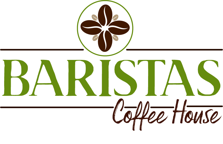
The brown colors are very neutral and don’t have a lot of personality while the green brings in a fresh, youthful feel. So how would the logo loog like with the main word “Baristas” in the green and the sub words “coffee house” in brown?
The answer is this:
What’s next?
The next steps in this process would be to improve on the logo and flesh out the color palette and typgrahy and to create a complete brand style guide. In the end it should also be tested on the target audience, what are their feelings about the colors and design? That’s the most important question.
Thanks for reading!
