Many of us use apps to book flights, and if we don’t use them for the booking itself we often use them to keep track of our tickets and to get relevant updates and offers. In this assignment the goal was to design a mobile app for iPhone that also works on a smartwatch (watchOS). In other words, two apps for the same fictive company, SkySmart.
The main objective was to create an app that worked seamlessly and in tandem og both devices. This was done by following the design thinking process, and considering the content first.
How should the SkySmart-app work?
The mobile app:
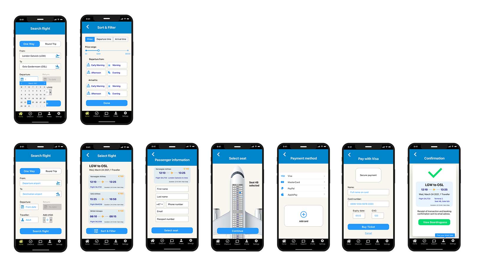
- Search and find suitable flights
- Choose the flight
- Enter personal details for the flight (name, passport, number, email)
- Choose seat on the plane
- Pay for flight (enter credit card/payment details)
The smartwatch app:
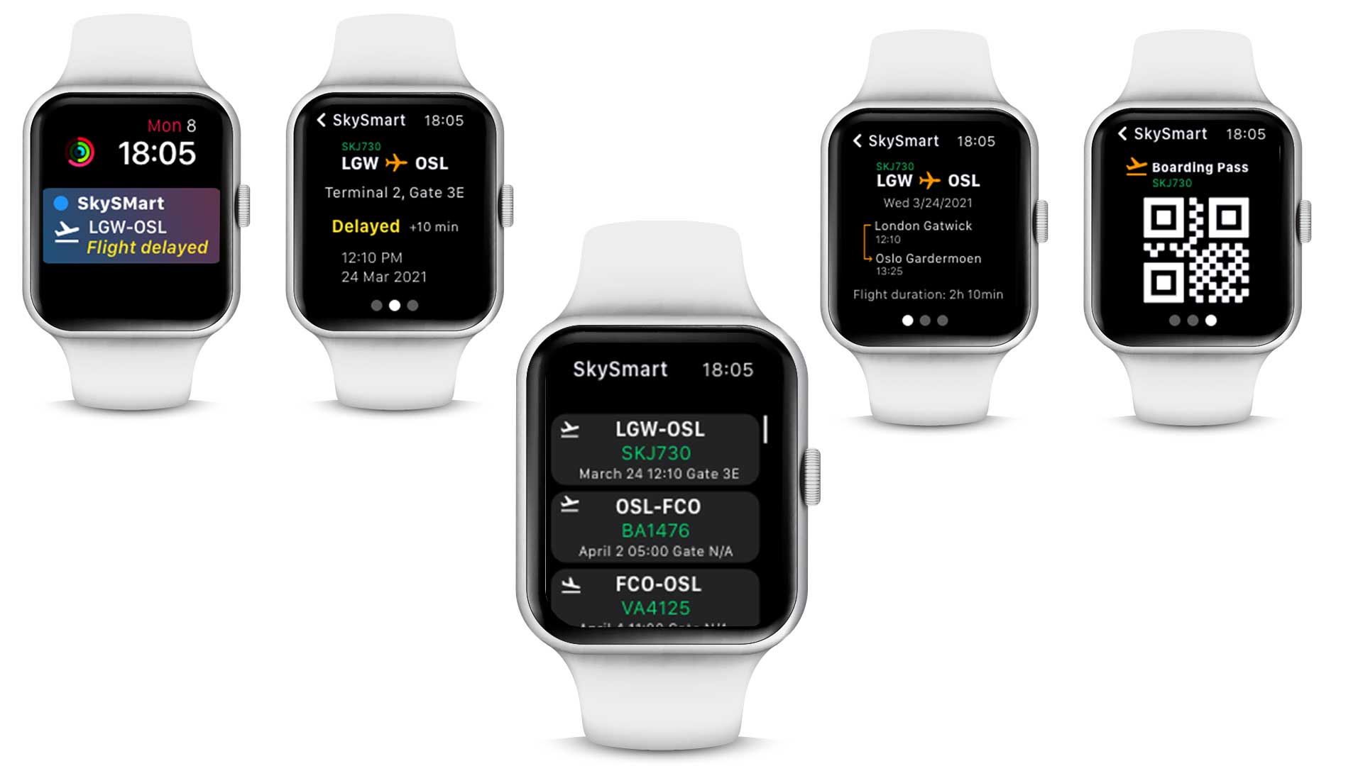
- View the flight departure date and time
- Check the flight number
- View the flight departure and destination cities
- See the flight duration
- Monitor the flight status (on time, delayed, cancelled)
- Access boarding pass
Even though this was not a case study, I sort of followed the Design thinking process, but the product did not go into high-fidelity wireframes or testing.
Getting started
I had already conducted research on smartwatches previously, and while this research was done with a fitness app in mind – it is not a big leap to apply this research to other areas where the need is similar.
From this research some of the favorite features was mentioned to be:
– Availability and getting notifications without disturbing others.
– Keeping track of goals and activities.
One of my questions about the user (research question) was:
– How and where would the user use the mobile/watch app – in which context?
I based my persona and scenarios on that previous research and what I think is the users goals, needs and frustrations. Research was also a continuous process during this task (literature review, competitor analysis).
Sketches and Low-Fidelity Wireframes
Before starting on sketches and wireframes I looked at other travel apps to see how they had solved certain, issues and to see what the best practices seemed to be.
The main purpose of the mobile app is to allow the user to search for flights, book them and allow for basic travel admin.
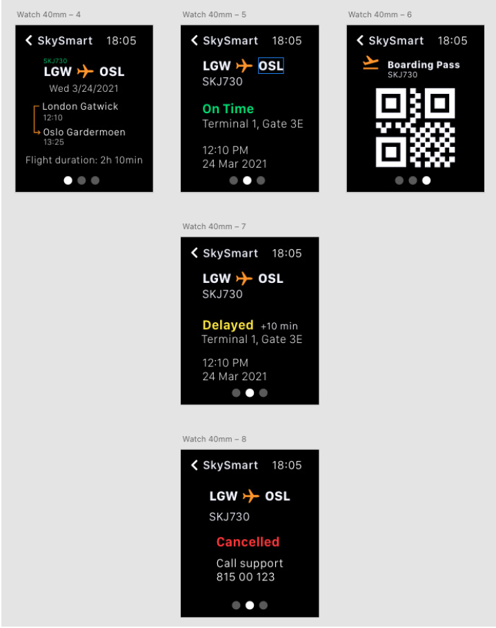
The main purpose of the Watch-app is to allow the user to see the most important information about their travel at a glance, to keep track of all their flight details and receive important notifications.
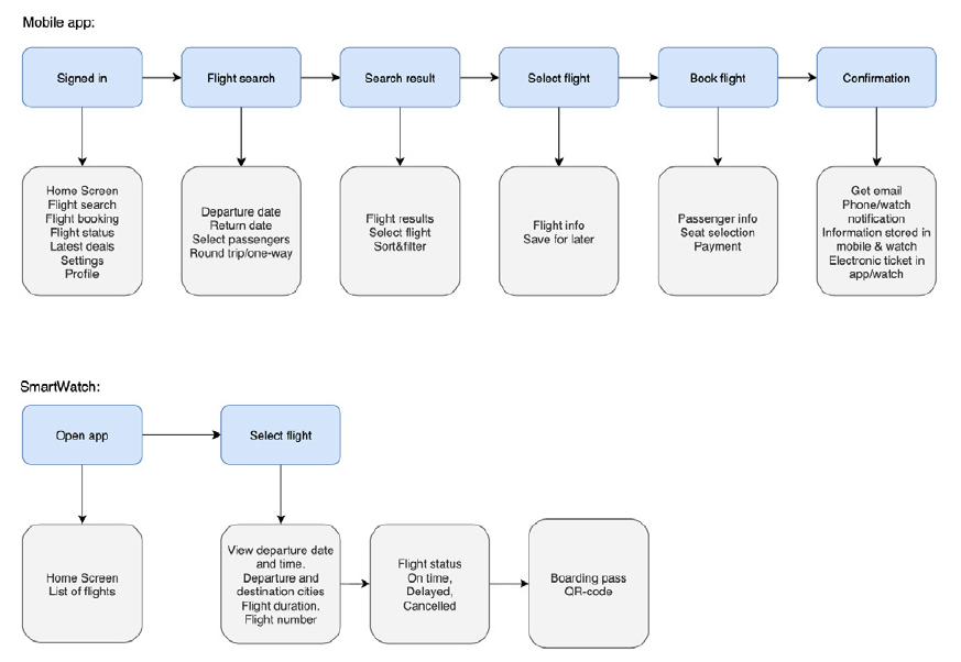
User Flow
The starting point for my customer journey for the SkySmart app is based on a signed-in user opening the app, and starting from the homescreen.
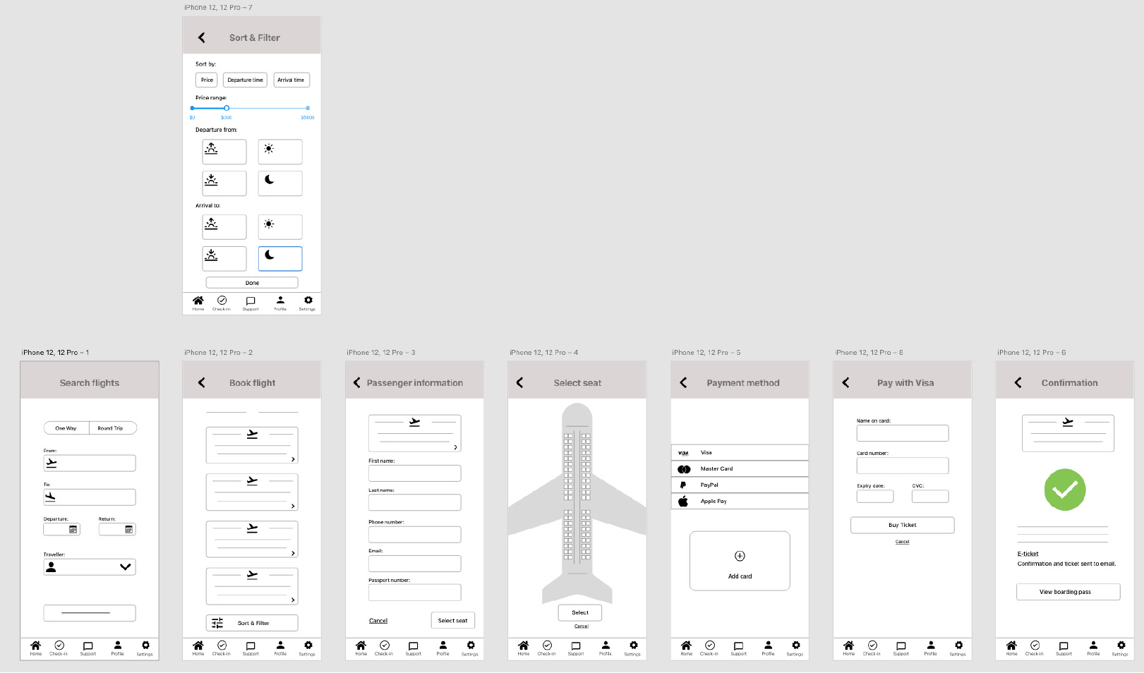
Low-fidelity Wireframes
The SkySmart app is thought to function on iPhone and WatchOS.
The pages and patterns follow a pretty standard set of rules and guides to provide and easy and fast way to search for flights. It also gives the user a way to manage and find previous and current bookings fast and easy on the go.
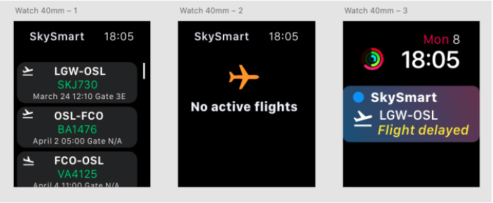
WatchOS low-fidelity wireframe
The thought when designing this app was that it should give the user information in a easy and fast way. It should tell the user what they want to know at a glance. So it should be fast and easy. Since the screen is so small, there is no easy way to give a lot of information – that is what the phone app is for.
(I know this more of a mid/high-fidelity wireframe, but I got a bit carried away)
Mid-fidelity Wireframes
Before starting on my mid-fidelity wireframes I went back over my research and also continued my search of other apps to find the most common patterns and how others have solved the usability issues with booking on small screens.
For the mobile app I went for a blue-ish color as the main color in reference to the company name – SkySmart – in addition to Apples recommended system colors for text and background.
For the SmartWatch I used Apple complications and the colorscheme from the Human Interface Guidelines. When going in to High-fidelity one can add SkySmart blue to the app as an accent color. Since this one went straight to mid-fidelity instead of low, I iterated on my design and made some changes and corrections.
More iteration is needed as the SkySmart apps move from mid-fidelity to high-fidelity. And of course the apps should be tested by real users to make sure they function as intended and solve the users needs.

0 Comments