A UX Case study
Water wastage
Water Wastage – A UX Case Study
With any design challenge it is important to understand what problem needs solving and why. And the challenge we are facing today is water wastage in Norwegian households.
Due to water scarcity there are still some geographical locations that struggle with procuring fresh water for their citizens, and as a result 1.1 billion people worldwide lack access to water, and a total of 2.7 billion find water scarce for at least one month of the year (Water scarcity, Threats. WWF, 2020).
Why is this a problem?
Norway is the least water-efficient country in the Nordic region, we lose 24 million litres of water every day due to leaking sanitary products (Start Norge, The water barometer 2020), and only 56% people in Norway think that they consume water in a sustainable and responsible way.
Solution?
In this case study we will try to uncover how, why and when water is wasted. We will come up with a product that could potentially reduce water wastage as well as educate people on this topic.
Is the driving force for change of behaviour knowledge, incentive or recognition? Or a combination?
Timeline
November-December 2020
Team
Cecilie Getz
Terese Hansen
Christian Wilhelmsen
Ilya Martchenko
My role
UX Designer, researcher
Project
Semester Assignment Noroff
Tools
Adobe XD
Photoshop
Illustrator
Airtable
Xtensio
Miro
Methodology
For this project we used the Design Thinking approach to gain an empathic understanding of the people we are designing for, and for the problem we are trying to solve. Based on our research we enter the define stage where we create representative personas, scenarios and find a clear vision and problen statement to get ready for the ideation stage and finding the solution.

The purpose of our research was to find out how we as humans can reduce our extreme consumption and wastage of water, so that every human around the world will have access to fresh drinking water.
Our research questions were:
👣 How can we educate and motivate people to use less water in Norwegian households?
👣 What makes Norwegian households waste water?
👣 What direct action can every Norwegian take to reduce water consumption?
To gain a better understanding of water scarcity, wastage and/or conservation in our area we chose to do both qualitative and quantitative research.
✅ Questionaire: For exploratory research a survey was sent out.
✅ Literature review: to gather secondary research (generative).
✅ Interviews: 4-8 one-on-one interviews to gather qualitative data.
✅ Usability testing: to evaluate the low-fidelity prototype (evaluative).

Participants and Recruiting
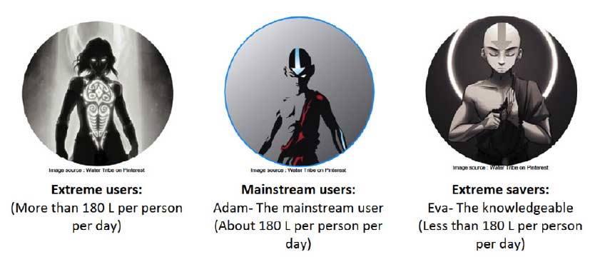
Since our scope was very broad, e decided to categorize our users into three main categories.
💻 Survey (50 participants)
📋 In-depth interviews (5 participants)
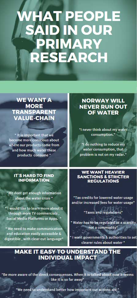
We chose these two research methods becuase qualitative surveys gives more insights than quantitative surveys. We wanted to uncover thoughts, motivations and knowledge about water waste. The survey was anonymous to make people comfortable speaking their tryth. And the interviews gave us an even deeper understanding.
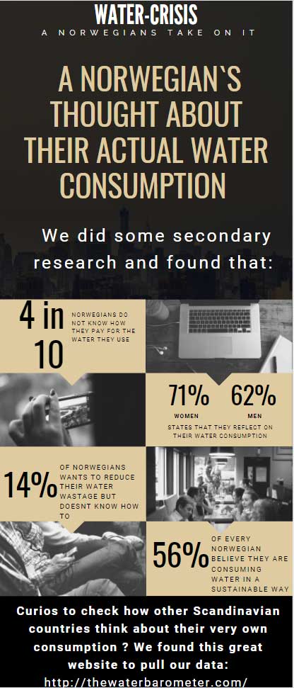
Primary and secondary research
Literature review, in-depth qualitative interviews and survewy was analysed by using Affinity mapping.
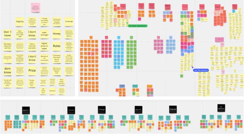
We discovered that:
🔎 Local governments are too passive in their action against water waste, not pushing or punishing the big-scale industries enough towards a more sustainable operation, causing havoc around the world as climate and the people suffer from a even more water scarce world.
🔎 With better oversight, regulations and information, Norwegians would be more wiling willing to change their water consumption for the better. Especially if they got some sort of incentive, like tax relief.
🔎 There are multiple alternatives available to reduce personal water waste, which people hear nothing about due to lack of media coverage. This makes it difficult for the average person to find easily accessible and relevant information in a user-friendly and consumable way on our media platforms and devices.
🔎 Norwegians are relatively water-spiled considering the massive resources they have and to properly create urgency for them to reflect over their water consumption, many believe higher costs and less accessibility per household can encourage Norwegians to reduce more actively and consistently.
🔎 Norwegians lack knowledge about the price tag around water wastage, globally as well as domestically.
🔎 Most Norwegians believe that by regulating water, the consumption rate will decrease.
🔎 Defective sanitary products and old and failing infrastructure is a main cause of water wastage in Norway.
From challenges to opportunities.
We created “How might we”-questions from our insights in order to turn challenges into design opportunities. The HMW questions helped us come up with creative solutions to solve the challenge.
- How might we get Norwegians to care about water waste?
- How might we make information about water wastage more available?
- How might we encourage local industries to oblige to a more sustainable consumption?
- How might we make water stewardship more rewarding?
- How might we enable easily accessible tips and trics alongside affordable tools to battle water waste?
- How might we get local authorities/government to take an active part in saving water/resources?
- How might we make it easier, fun and engaging to save on water consumption?
- How might we make people more aware of the value-chain and water use behind their purchases?
- How might we illustrate how much water is wasted everyday, and it’s impact on the climate?
- How might we inform about how water is contaminated by the industry?
- How might we make the impact water stewardship has, more visible?
What is the problem?
Water waste in Norwegian households, and the lack of information, knowledge, incentives and adequate tools to reduce the water consumption
Who experiences the problem?
Everyone experiences it, corporations, industries and people – whether they are aware of it or not. Especially eco-conscious people.
Where does the problem occur?
It happens in your house, backyard, at your neighbours, in the local store and even on an industrial scale.
Why does it matter?
Because it has a devastating impact on the planet, and everyone and everything on it.
Problem statement
Our Norwegian households are the least water effective in the nordics due to lack of information, knowledge and incentives to reduce water consumption. If we can solve this problem, it would impact the households and the environmental footprint positively. Maybe most importantly to Norwegians, the cost would plummet.
Vision statement
“Our solution will help anyone who wants to reduce their water wastage by making information, knowledge and incentives, and a mainstream of adequate tools easily accessible. ultimately allowing people to go through and affordable step-by-step process in reducing their environmental footprint”.
Meet the Mainstream User Adam – The primary persona
Adam was made to represent the main group of participants. He is the face of most Norwegians; the people that don’t see water as a scarce resource, because they are not educated on the topic. He is willing to reduce his water consumption if he is shown the consequences of water waste, his purchasing footprint and the results of his reduction. His main motivator is getting a tax relief or discount on his water bill.
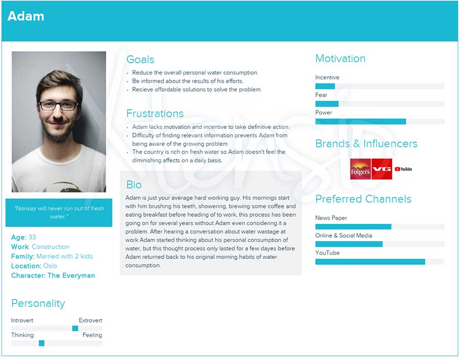
Persona picture from Pixabay
Meet the Extreme Saver Eva – The secondary persona
Eva was made to represent Adam’s opposite, the people with a high level of awareness. She is an environmentalist, and the type to inspire and educate people to take action against water waste and climate change. She fights for a sustainable and healthy planet to live on, starting with combating water waste.
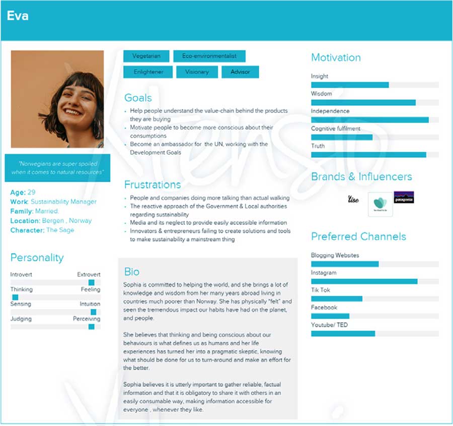
Persona picture from Pixabay
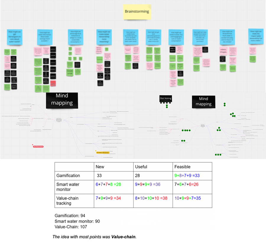
At this stage we started ideating different solutions to water waste, and we started by conducting an ideation workshop to find solutions based on our HMW-questions. We voted on the tree best ideas. Since they all were ideas for an app, we then used mind-mapping to create the features and direction we wanted. We finished this off by using the NUF method to grade the tree best ideas to find the top idea, which were a value-chain app
✔️ Brainstorming (divergent thinking)
✔️ Mindmapping (Tree-model)
✔️ NUF (convergent thinking)
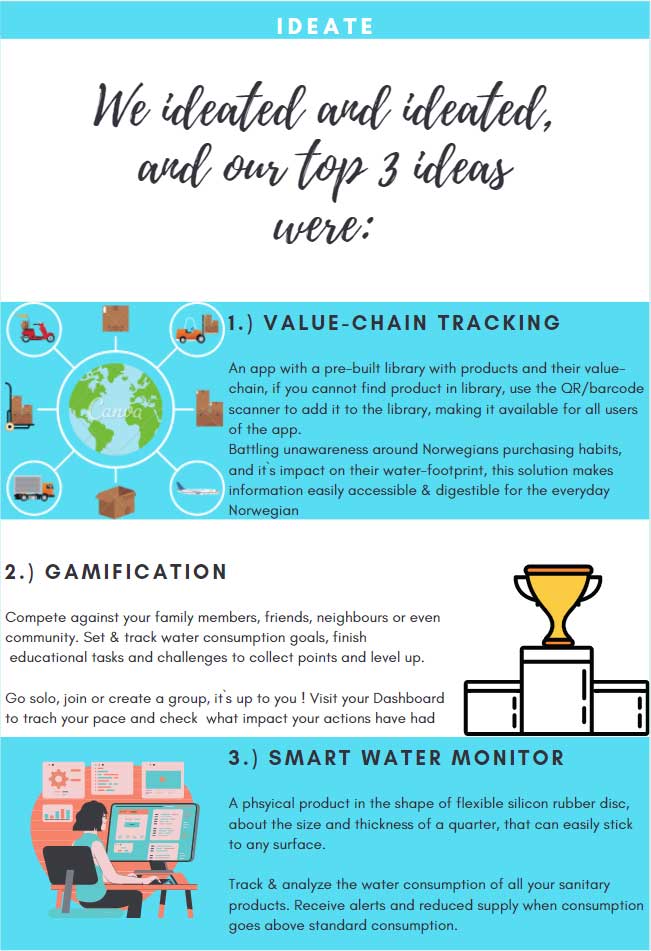
The Product..
..is an app that tackles a problem facing all consumers of water today; information about where the water comes from, how it’s used and what impact it has on the planet and people.
Adam is able to easily browse a product library which gives him a full overview of sustainable products and stores, he can also see the product information from materals and ingredients, down to the specific details such as origin and source of water.
If Adam doesn’t find a product in the library he can use the intuitive AR-scanner to quicly add a missing product to the library. He can set and track his personal goals in regards to reduction and see the impact his actions have directly. To make it even more rewarding, Adam collects points every time he scans a missing product and adds it to the library, which he later can cash-in by collecting coupons and discounts.

Requirements
Based on the personas and problem- and vision statement we have identified the design requirements. This was done by having an open discussion in our group on what our personas needs and pain points are. And to make sure the requirements fit our product, we also based them on our HMW-questions.
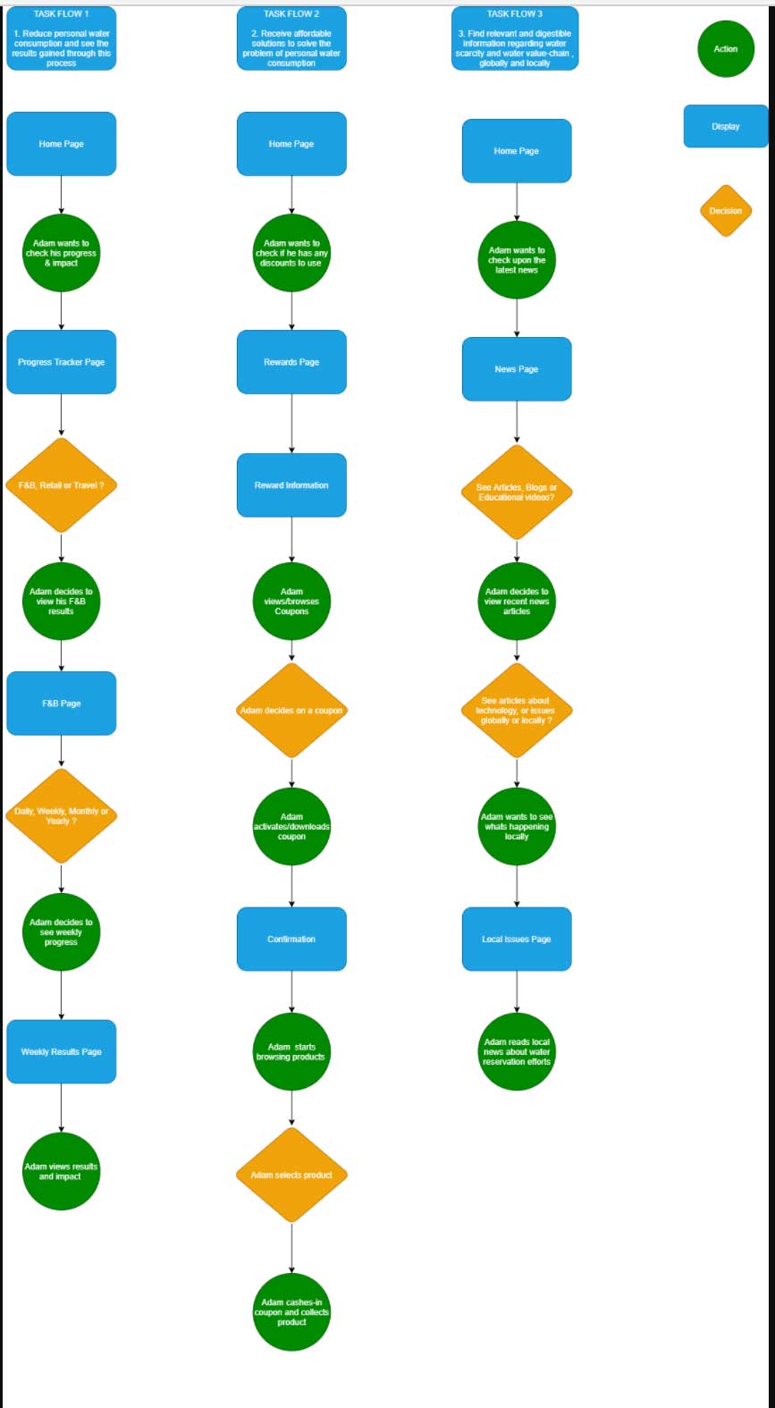
🛠 Reduce personal water consumption/waste and see the results gained through this process.
Set and track goals and also find products to help save water. You can also find information about products and their value chain.
🛠 Receive affordable solutions to solve the problem of personal water consumption/waste. Track progress and get rewards in the form of discounts and coupons.
🛠 Find relevant and digestible information regarding water scarcity/waste, globally and locally. Products and news in the form of articles and blogs.
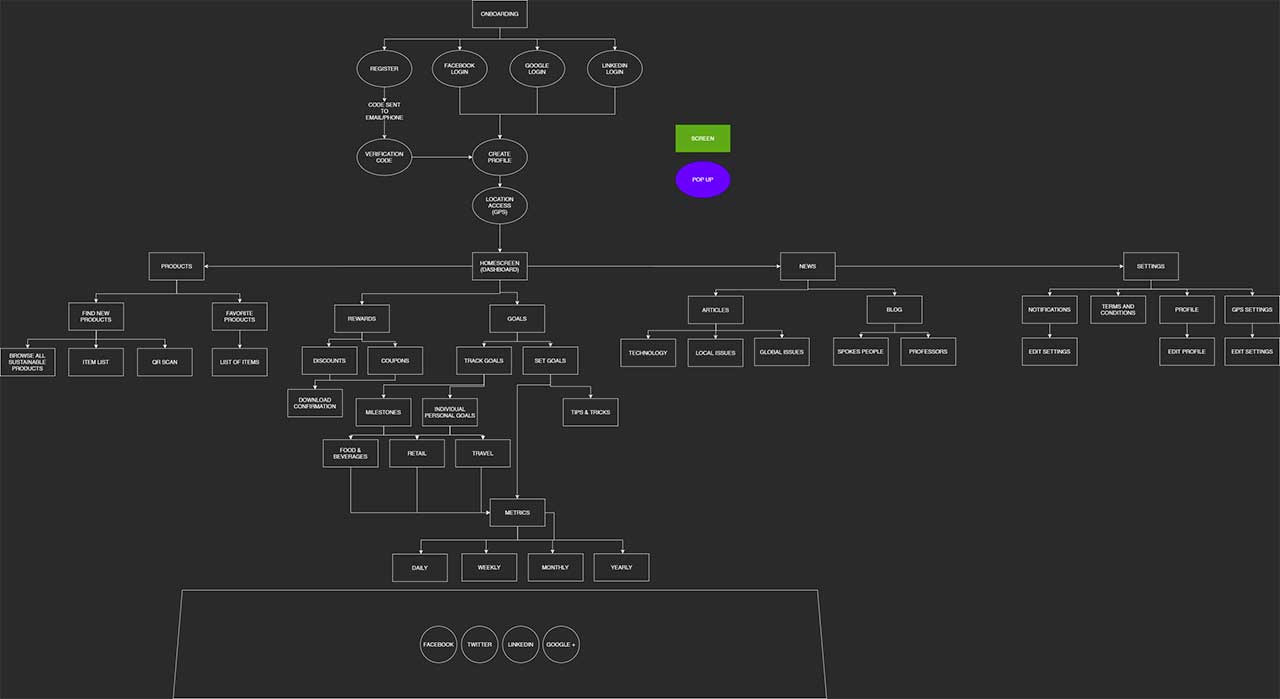
Information architecture
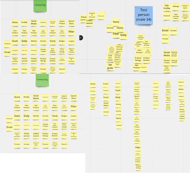
IA is the blueprint of the design structure, and can be generated into wireframes and sitemaps for the project. To make sure our navigation and layout was user friendly, we conducted a card sorting exercise. The participants fit our criteria.
We conducted and open-card sorting, so the participants did not get any headlines or main categories. They placed all content freely.
IA and User Flow
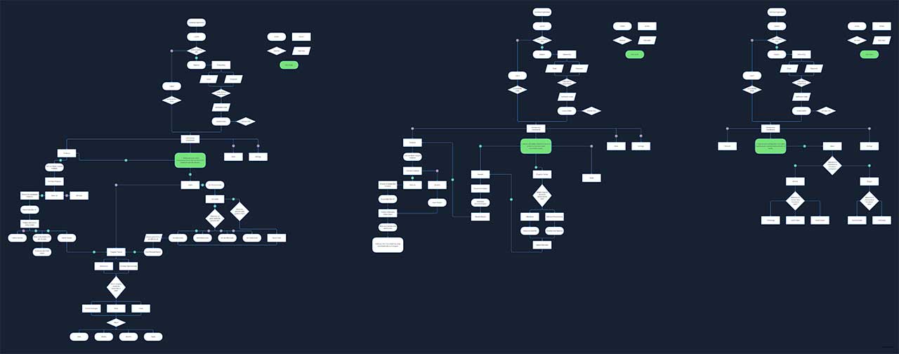
Task Flows
The task flows is just a single flow that doesn’t branch out. It is a task that is completed similarly by all user for a specific action. The flow tend to be linear and illustrates the high-level steps our user will take to get to a end point or complete a task.
Wireframes
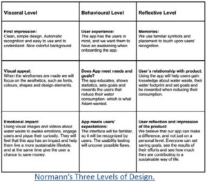
When developing the wireframes we considered the Three Levels of Design (Don Norman), to make sure the app connects with the users’ needs and goals.
We need to create a relationship between the app and the user, and the app needs to bea easy, helpful and engaging to make users’ want to use it continuously.
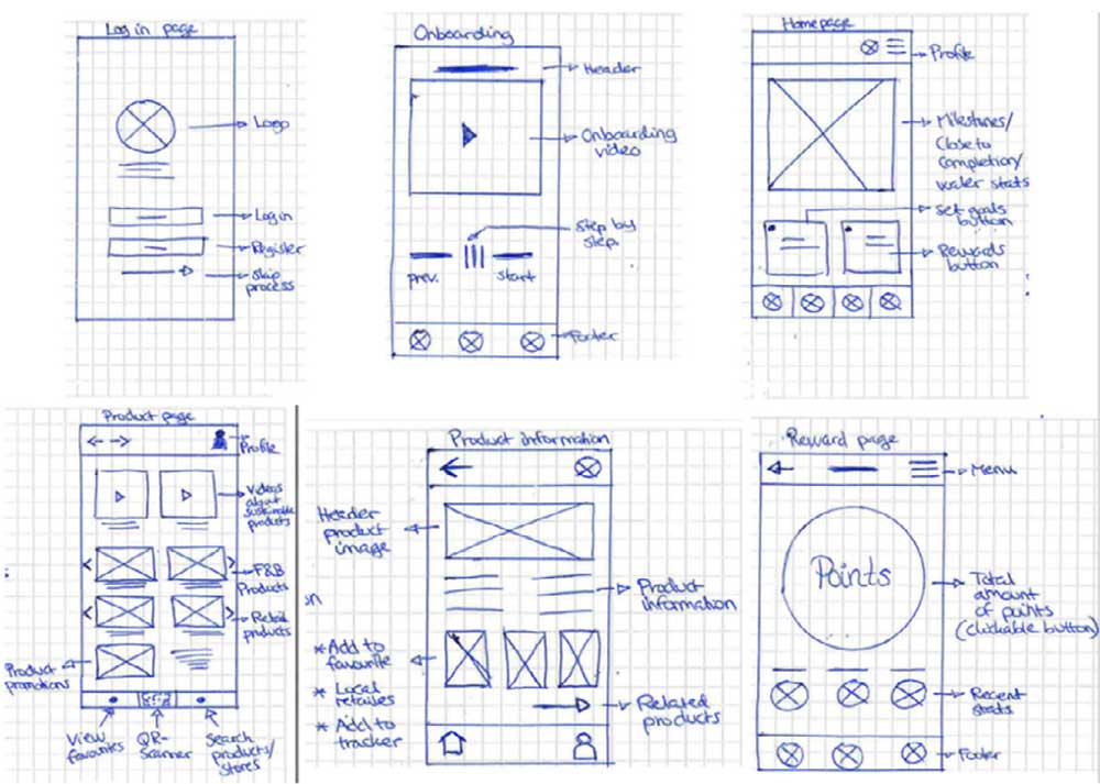
The process first started with sketching and visualizing our mobile interface on screens on paper.
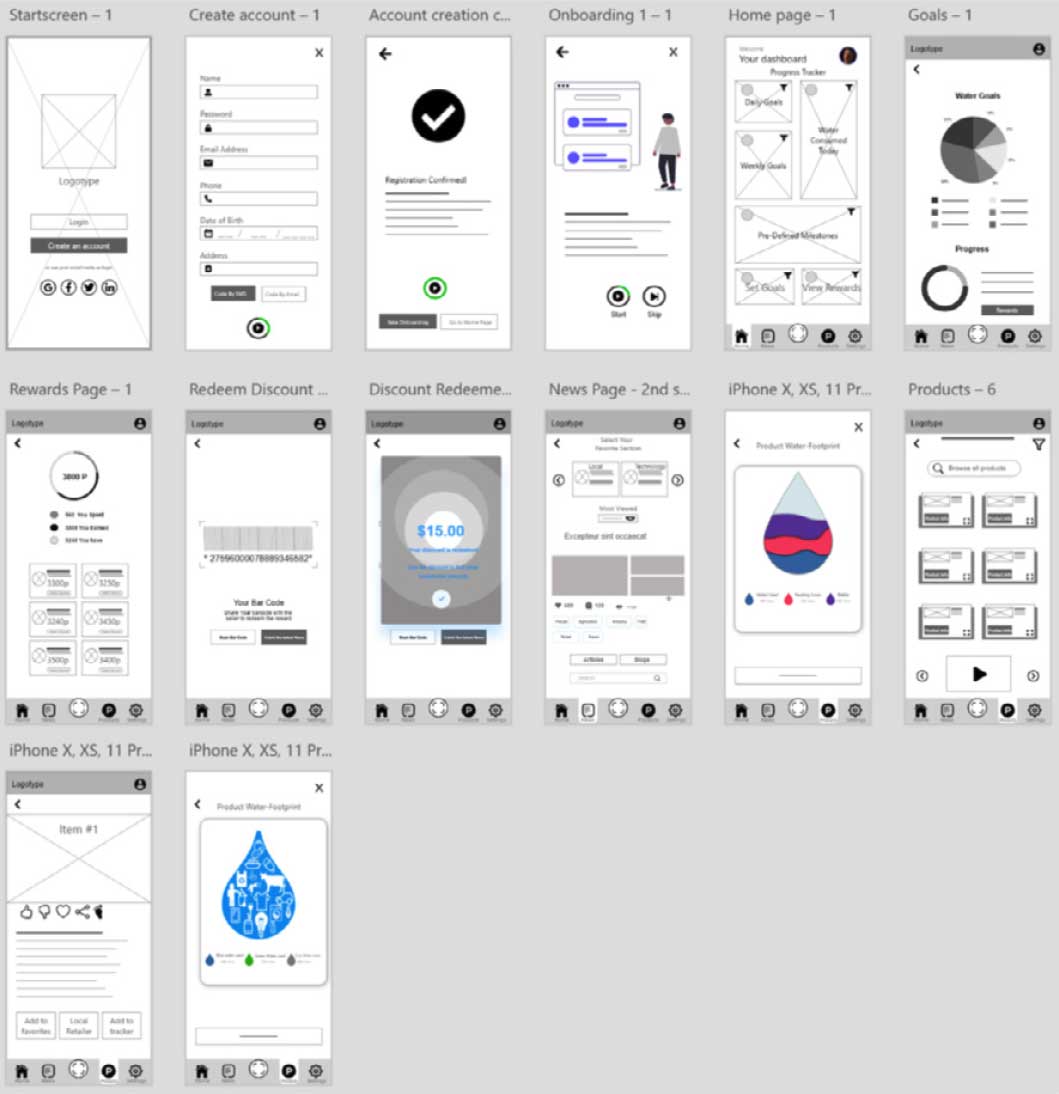
After that we created the low-fidelity wireframes in Adobe XD.
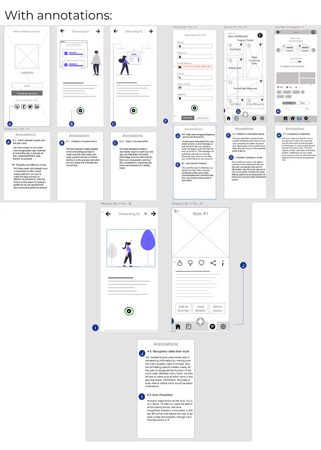
We kept both best practices, design- and gestalt priciples in mid when designing the wireframes. We kept the design intuitivt and easy to follow, and also taken the F-pattern into consideration. Our menus are also placed where the users would expect to find them.
Gestalt principles
Proximity/common region – We’ve placed related content close, because they appear more related than if they were placed further apart. Common region is related to proximity, and means that when objects are located withing that same region, we perceive them as belonging together.
Similarity – We’ve established similar groups of content and will further aply this principle with color to distinguish different sections.
Focal point – The things that stand out in the design visually will capture and hold the viewer’s attention first. We’ve used this principle to draw the eye to the QR-scanner button for instance and also used graphs and other elements to draw the eye to what’s important on each page.
Low-fidelity wireframes
In the last stage of Design Thinking we planned and conducted usability tests. The purpose was to identify usability problems, and to see if we have made a product that meets the users’ needs, wants, goals and mental models. We screened participants with an online survey, and the test was conducted with a facilitator – moderated and recorded, and then added to a capture sheet for further analysis.
1. Screener
A mini-survey was sent out to people on social media platforms, and their answers either qualified or disqualified them for the user test.
2. Pilot test
Running a pilot test allowed us to test the facilitation techniques, test the script, tasks and the equipment to identify technical issues. We made the neccessary modifications after discovering inconsistencies, tested again before engaging the participants.
3. Usability test
Because of covid-19 we conducted this test remotely and moderated through phone/video interviews. This method gave us the opportunity to test any person in our city using an online communication program that records the participants when they tested the prototypes from Adobe XD.
“Overall I think it’s great. You simplified it, and I am a huge fan of simple apps.”
– participant 4
Testing methodology
- Moderated – Phone or video inteview
- Moderated – In person, Lab testing
The techniques used for the testing were:
– Concurrent Thinking Aloud (CTA) where we encouraged the participants to think out loud and share their thought process while completing the tasks.
– Concurrent Probing (CP) This technique allows the facilitator to probe the participant for information when the participant does or says something unexpected during the testing session.
Findings and Reccommendations
Analysis and observations
|
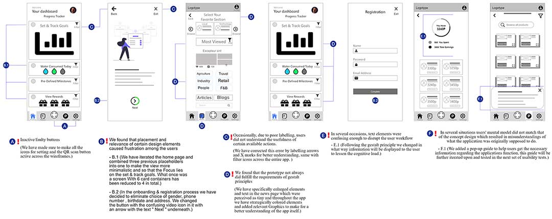
❌ In several situations users’ mental model did not match that of the concept design which resulted in misunderstandings of what the application was originally supposed to do.
|
💡 Possble solution for this is to increase the emphasis on the onboarding experience so that users will get a better understanding of the applications functions and the overall design. One way to do this is to implement pop-up guides that explaing the current function the user is using and its design purpose. |
| ❌ In several situations text elements were confusing enough to disrupt the users workflow. | 💡 Possible solution would be to review faulty labels and text elements and replace them with more recognizable and direct asosiations to better improve the workflow. |
| ❌ We found that the overall perception from the participants regarding the intention of the app was good and they felt it was a useful app to battle water waste. | |
| ❌ Inactive/faulty buttons distracted users with maintaining a steady workflow. | 💡 Review the connections between the wireframes and its design elements and fix the faulty/inactive buttons before continuing with the next iteration of usability tests. |
| ❌ We found that although certain design elements were correctly placed and relevant, occasionally, users would not understand their usefulness because of poor labelling. | 💡 Before moving onto the next stage in the design process, we would recommend better labeling to obvious elements like arrows back and forth with “ Back “ & “ Next”, this will make next users better understand that the elements can be used and wiggled with. The same regards our filtering elements, without guiding text below the element, the user is going to struggle to understand what to do with it. |
| ❌ The (menu navigation) tab bar was well received, and will be kept. | 💡 Since this element was received well our recommendation would be to increase its fidelity by introducing colours and other design elements. |
| ❌ We found that placement and relevance of certain design elements caused frustrations among the users. | 💡 For the next round of testing, we recommend removing the choice in the registration process about gender as it feels not relevant, same regards requiring users to leave phonenumbers in the process. We also recommend changing the prioritization of the placeholders in the homepage view, goals should be the main focal point and merged into one placeholder not 3 different like we have now. In the onboarding & registration process , we recommend changing the video-button inside the circle with text like “ move on “ instead to make the action more understandable. |
| ❌ We found that bugs occurred which interrupted the overall experience for the user, as they were not able to perform certain actions as intended. | 💡 We recommend to do several test runs of the prototype before launching usability tesing with external participants and informing users about the need for a strong and stable wifi or network connection while performing the tests. |
| ❌ We found that the prototype did not always fulfill the requirements of Gestalt principles. | 💡 Moving on with the process, we recommend to use colors more actively across the design elements but also to use better graphics in our placeholder that are more relevant to the specific content. One user also pointed out that particularly the News page section and its elements were small, the same regarded the categorize, both elements and text should therefore be enlarged. Lastly, we got feedback on some elements being out of place, these should also be aligned better before testing again. |
Design iteration
After testing and analysing the results the wireframes were revised and the design iterated on.
Conclusion
This process has shown us that most Norwegians have difficulties finding accessible and digestible information for them to get personally involved in reducing their water consumption. However, early results from the usability testing showed an increased interest in the topic and higher initiative to reduce personal water waste when provided with more information and incentives.
Findings that answers our problem statement:
✅ With a product that motivates, informs and rewards people for their efforts in reducing water waste, many Norwegians are willing to change their consumption.
✅ The main factor for the willingness to change and reduce water waste is gaining points which will result in discounts, while the user feels like he/she is doing the right thing and is on a path to a more sustainable life.
✅ The engaging part of the app is the QR-scanner which makes it possible for users to scan products in stores, and to see information videos/articles and the water footprint of the product. This gives the user a chance to make a conscious decision to buy or not to buy the product – while earning points at the same time.
I learned a lot in every step of this process, how to listen, research, keep an open mind and how to work on a team towards a common goal. We all had our strengths and weaknesses, and different areas where someone was more of an “expert” than others. But I think we managed to distribute the workload evenly and our differences and discussions was solved and conducted in a diplomatic manner.
Our product might not have solved the entire problem, but my hope is that this project can spread some awareness around water wastage and inspire others to take action.
What’s next?
The next stages in the Design thinking process is to further test the new, and improved prototype. This will show us if there are more pitfalls and iterations that needs to be done before making high-fidelity prototypes.
Click the link to see the entire Water Wastage-project in a .pdf-file
It seems like the driving force for a change of behaviour really is a combination of gaining knowledge and motivating people by rewarding them, and letting people know that their efforts really matter.
Thank you for reading!
