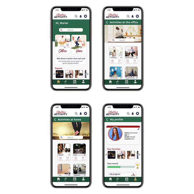
A UX Case Study –
The impact of loneliness
The Impact of Loneliness – A UX Case Study
Project Overview
THE PROBLEM
Loneliness can have an impact on anyone at any given time in their lives; it does not discriminate against age, gender or even professional background.
THE TASK
Research causes for loneliness and present the top findings, as well as the top idea for solving the social pandemic of loneliness.
THE AUDIENCE
Everyone can be affected by loneliness at some point in their life.
My role
UX designer, researcher
Team effort: Research and affinity map
Members: I. Martchenko, C. Wilhelmsen, C. Getz and T. Hansen
October 2020
Tools
Photoshop
Illustrator
Adobe XD
Miro
THE PROJECT
This project was for my UX studies at Noroff.
Methodology
I have used Design Thinking approach in order to understand the problem and people’s needs, becuase this process is very user-centric and makes it a bit easier to organize the whole process and find effective solutions to the problem.

- Research
- Analysing and Synthesising
- Define the problem
- Personas
- Scenarios
- Ideating solutions
- Requirements
- Information architecture
- User flows
- Low-fidelity sketches of idea/solution
- Usability testing

The first step in the Design Thinking process is to empatise, and is all about understanding the problem that needs solving and who experiences the problem. In order to achieve this understanding, I gathered both qualitative and quantitative data.
For primary research we sent out two surveys and recruited on social media. We also conducted secondary research in the form of a literature review.
THE SURVEY
We sent out two surveys to gather as much data as we could, both qualitative and quantitative.
Survey 1 got 51 responses, and survey 2 got 39 responses.
Some of the questions we asked were:
- Demographics: age, gender, location, civil status
- How often they socialize with others
- If they’ve felt lonely recently or at all
- What they do when they feel lonely
- What they think causes loneliness and how they can prevent it
- How often they use social media
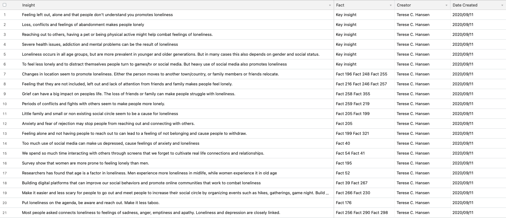
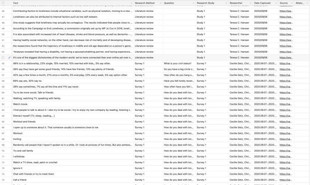
All facts found in the research phase, literature review and surveys was added to a spreadsheet and used in the affinity mapping to find insights later.
Facts:
Analysing & Synthesising
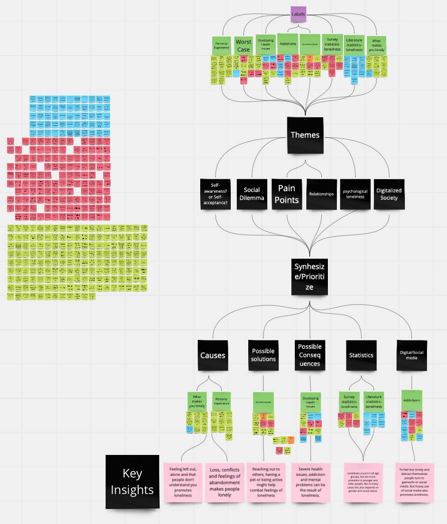
In order to make sense of all the information we collected through our research, we imported all our facts into Miro and conducted an affinity mapping session. This session led me to find several insights, and 6 key insights, by asking the 5W’s and H questions.
Conclusions
My conclusions are based on all research gathered and the formed insights.
- Be inclusive and see the people around you. Take an interest and reach out, talking to someone or being the listening ear might do wonders.
- When moving to a new place, keep in touch with family and friends while you get used to being in a new environment. Volunteer or find the social center of the town and sign up for activities. That might be the start of a new social circel.
- In periods of grief or conflict, find someone to talk to. Even if you don’t feel like it, reach out to someone for just a little while.
- As a society we need to make it easer for people to reach out and meet each other in real life. Organize activities and social gatherings anyone can sign up for. Make it less scary to meet new people, and make it about including others instead of expectations and performance.
- Built digital platforms that can change the way we use social media. Put loneliness on the agenda and try to find ways to combine social media with cultivating real life connections and relationships.
The next step in Design Thinking is the Define stage, which is based on the research findings from the empathise stage. Using that information I created persona, scenarios and problem statement.
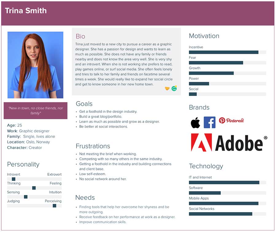
Persona
The persona is based on my assumptions of what the archetypical user would be like, and answers the question: “who are we designing for?”
Context scenario
Persona: Trina Goal: Feeling less lonely and building social network
1. Trina just moved to a new city and started a new job as a graphic designer intern.
2. She doesn’t have many colleagues and no friends or family nearby.
3. After work every day, Trina goes home alone. When talking to a friend on the phone she tells her how lonely she feels and that she wishes she had something to do or someone close by to go ut with or talk to. The friend tells her about this new app that is great for making connections and meeting other people.
4. Tina downloads the app and starts to browse the community and forum. She plays a few games and chat with others on the app. After a while they plan to meet up and eat lunch together.
5. Trina is excited about the new possibilities with the new app.
Key path scenario
Trina downloads the app from app store and reads the introduction and terms of use, before she creates a profile for herself. She then scrolls through the different features of the app; the forums and chat functions, the tips section, the games you can play with others from your city and scheduled IRL activities and meetings. She then joins a game of poker and starts to chat with the others on her “table”. She finds out they all signed up for a lunch meeting the next day not far from where she works. Since they seem nice, she also registers for the same lunch activity.
Problem statement
People that move to new cities can experience loneliness becaus e they move from a place where they have a network – close friends and/or family – to a comp letely new area where the social network in most cases ar e non-existent. If we can solve this problem with our app, it would mean that our users have a easy wa y to connect with others and expand their network through positive activities. This tool will help combat loneliness and will also gain our company positive feedback and reviews and boost our other apps and ventures.
Vision statement
Our app helps Trina and others that move to a new city and wants to meet other people in order feel less alone by providing a way to meet other people by joining activities or play games.
In the third stage of the Design Thinking process it is time to generate ideas. I now have a good idea of who the user is, their needs and goals. To further fuel the ideation sessions we asked HMW questions:
- How might we make it easier to make connections to people in new places?
- How might we create a social platform that does not promote loneliness?
- How might we make it easy to interact with others?
- How might we make it easy to meet people in a new town?
- How might we make it so people have a way to expand their social circle?
- How might we make it easy to make connections regardless of what type of person you are?
- How might we create an inclusive platform?
- How might we create a platform that does not care about social status, looks, income and how successful you are?
Ideation workshops
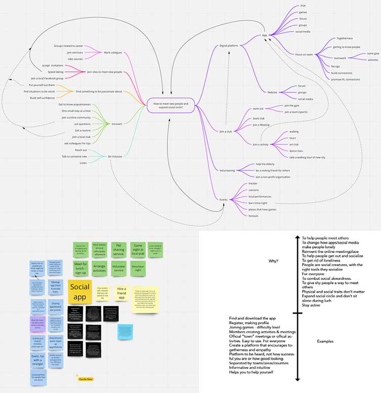
To find as many ideas as possible 3 ideation sessions were performed.
The first was a mind/tree map to find as many ideas and connections as possible. The second session was a brainstorm, to confirm that the top idea was the best one and the last one was laddering – to help us look at the desigh challenge from different perspectives.
Vision statement
“My solution will help people that relocate expand their social circle and find new friends by being inspiring, motivating and provide the tools neccessary. This will allow people to connect with others in a easy and fun way, in a safe environment that promotes friendships and social interaction.”
What the product is, and what it should do.
The product is thought to be an app. The aim of the app is to promote socializing with others, not only online but in the real world as well through playing games in small groups, organising and signing up for activities in your town and in that way increase your social circle. The thought is to focus more on interactions and easy meetings with small groups to decrease the pressure, and focous less on looks, social standing and success.
Requirements
The process explains what the product is and what it should do, and includes data-, functional-, technical-, and contextual requirements. The design requirements was identified by the personas and the problem- and vision statement. The personas’ goals and pain points were taken into consideration, and I also based them on my HMW-questions.
🛠 Play games
Virtual “rooms” where you can play small games in small groups to get to know others.
🛠 Activities
Organize or sign up for activities to meet others. Maybe you want to go out to eat lunch or dinner, go to a concert, watch sports or join a tour of the city etc etc.
🛠 Message and chat function
Have the possibility to send messages to other users, and chat with them when playing games etc.
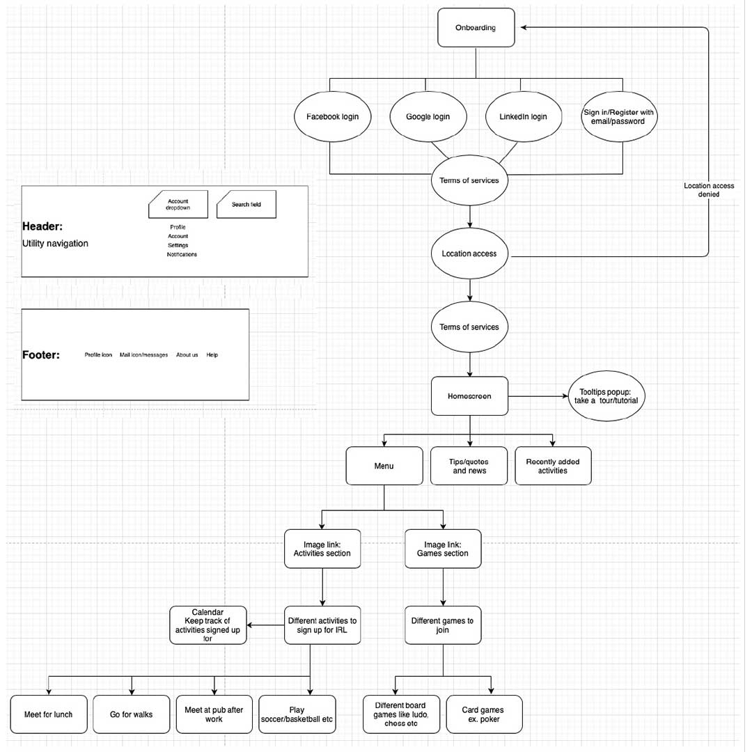
Information architecture
After finding the requirements, the information architecture was born. To avoid frustrating users content has to be organised and stuctured in a way that promotes usability and makes it easy to navigate the app.
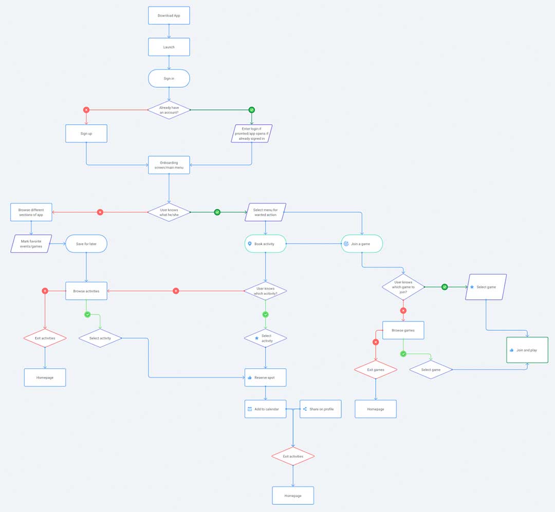
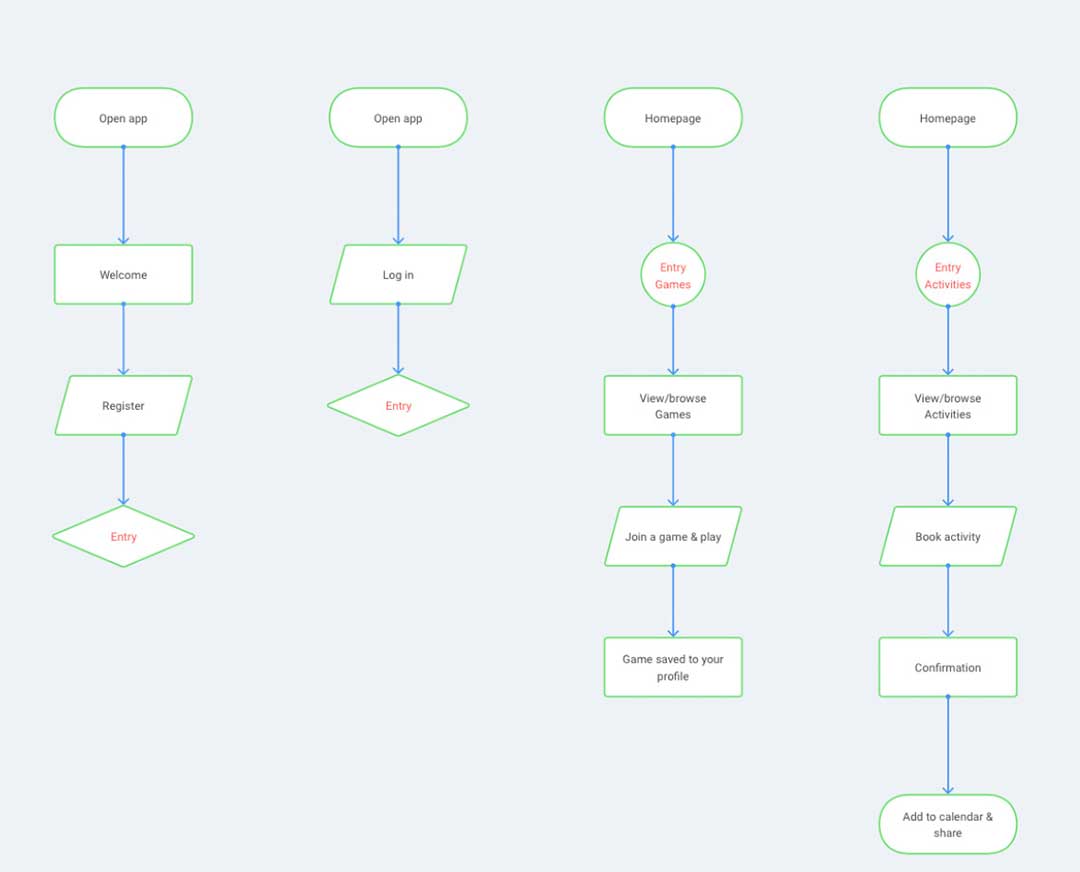
User and task flows
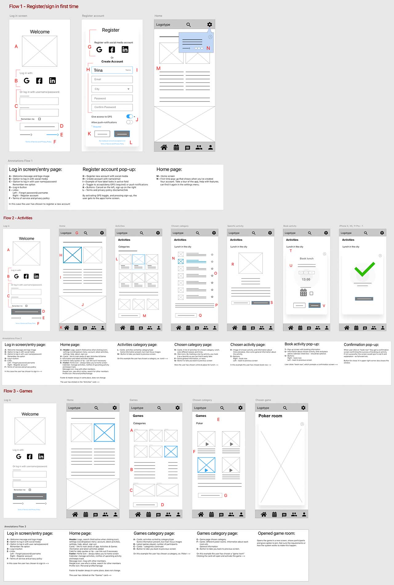
The flows focuses on what the user needs and their goal. They depict visually how the user will navigate through the app.

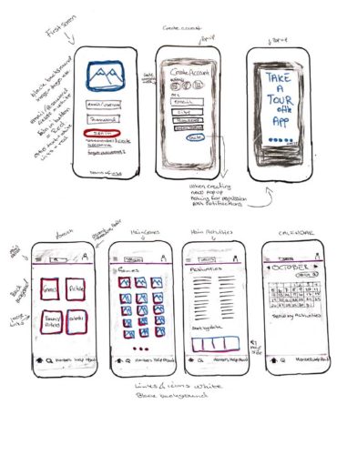
During the prototyping stage I made sketches and low-fidelity wireframes of the app, so that I could come up with the best possible solution.
Persuasive design
This seeks to understand and interpret human behaviour based on the data collected during the previous stages.
The main goal is to help the users in their decision making and help the designer to communicate better.
Norman’s Three Levels of Design
| Visceral Level | Behaviour Level | Reflective Level |
| First impression: Clean, simple design. Automatic recognition, easy to use and understand. | User experience: The app should have the user in mind. Intuitive tooltips that show the users the most important features. | Memories: Will use familiar icons, layout and interface. This will make sure of the users recognition. |
| Visual appeal: Fonts, colors, shapes, images and design elements will work together to form a pleasing experience. | Does the app meet the user’s needs and goals?: The app will provide the user with the tools to meet others. It engages and motivates so that the user can reach their goals. | Users relationship with product: The app will help the user interact with others, get to know other people and increase their social circle. |
| Emotional impact: Use positive colors and images to engage the users. | Does the app meet the user’s expectations?: A familiar interface will make sure that the user recognizes how to use the app and it will have low cognitive load. Usability testing will uncover any problems. | User reflection and impression: I think this app can make a difference to people that relocate and struggle to find a new social circle. It will engage them and make it fun and non-threateing. |
Sketches
Wireframes
Low fidelity wireframes
The wireframes are based on the user/task flows, as well as the information architecture and requirements.

The last stage in Design Thinking is the test phase. And I made a prototype I presented to real users for testing and feedback. For this I used the platform UserZoom, and conducted a unmoderated and remote usability test. I had a screener so that only people that fit the persona/user were able to proceed to the test.
The test itself was a combination of qualitative and quantitative. Direct observation and assessment on how the participants interacted with the prototype, and they were asked both open- and closed-ended questions to gather their opinions on the user flow and the overall usability of the product.
The users that got through the screener got a predefined task to complete, to see how they responded and interacted with the design.
Attitudinal vs. behavioural research
The participants were encouraged to think aloud (CTA) while completing the set task. This was to see if there was any correlation between what they said vs. what they did during the test.
The prototype
The wireframe/prototype tested was the user/task flow to the activites part of the app, and how to browse and book activities. I considered this to be the core of the app and the most important use- and task flow.
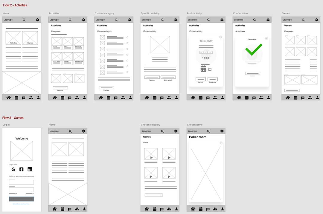
Besides observation, the other metrics used to find information was success rate, critical error, non-critical error, time to completion and subjective measures.
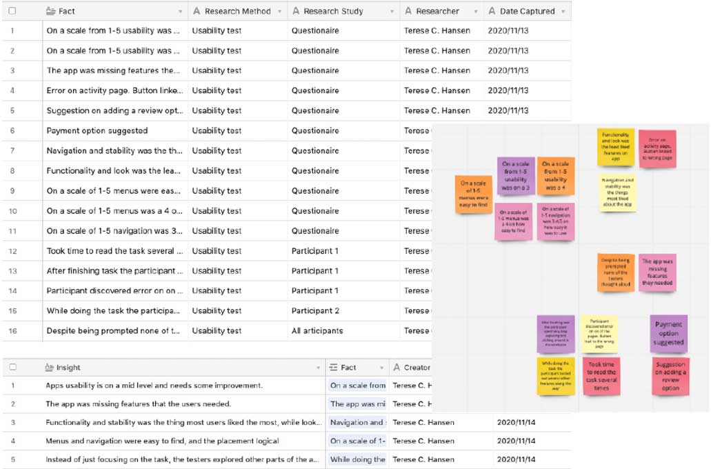
I used an atomic research method to analyse and synthesise the findings of the usability test. The finding are based on the recordings and feedback from the users.
To summarise
- Bug: A non-critical error was discovered during participant 1 test session. When clicking the button to go back a page on the selected activity page, you arrive at the book activity page instead.
- Usability issues: The participants rated the usability from mid to high, meaning that the usability is ok and could be a lot better. Observations did not reveal any severe issues, and some of the feedback can also be due to this being a low-fidelity wireframe.
- Look and functionality needs to improved.
Conclusion
General thoughts and learnings.
This was one of my first projects and case study as a novice UX designer, and I learned so much from this process. We worked as a team of four in the first step, empathize, and did the research and affinity map together. Then we separated and formed our own insights and conclusions and went through the rest of the Design Thinking process solo.
This assignment has taught me to empathise and listen with an open mind, and to see the big picture and not get caught up in all the small details. I also got a whole new understanding of Design Thinking, and that it really is an iterative process. It’s easy to get stuck on a solution, but if it doesn’t work for the user’s and solve their needs, then the solution is wrong.
I enjoyed every step of this process, but the area I faced the most challenges with was the testing. Both technical and with recruitment. But in my experience it’s the things that goes wrong we learn the most from.
What’s next?
The next steps in this process would be to take the information gathered from user testing and make the improvements on the low-fidelity wireframes and then make a mid-fidelity prototype for further testing. I feel that more testing is neccessary to see if this product would meet the potential user’s goals and needs.
Click the link to see the entire Loneliness-project in a .pdf-file.
Thanks for reading!
