Being active is not only important for the body, but it’s aslo very important for the mind. It can give a sense of accomplishment, raise self-esteem and help us set goals and achieve them.
Physical activity for mental well-being
Many of us have been living with social distancing for over a year now, and many have been in their homes alone with little to no contact with others. This has surely affected their overall well-being and especially their mental well-being. This affects how people think, feel and act- and it also determines how we handle stess, relate to others and make choices.
Activity is a big part of mental well-being and can give positive reinforcement in other areas as well.
For this case study I’ve used the Design Thinking approach.
Timeline
April-May 2021
My Role
UX Designer, researcher
Project
Project exam Noroff
Tools
Adobe XD
Illustrator
Photoshop
Flowmapp
Airtable
Drawio

In any design challenge it’s important to understand the challenge. So what is the problem?
Mental wellbeing affects how people think, feel and act. It also determines how we handle stess, relate to others and make choices. Mental well-being is important at every stage in life, from childhood and youth through adulthood. Mental wellbeing can have an impact on anyone at any time in their lives; it does not discriminate against age, gender, or even professional background. We as humans like to create social structures to support our mental-wellbeing. To name a few, people need human interaction, healthcare, financial freedom, and physical and mental health. The lack of these structures can have a negative impact on our mental wellbeing.
Evidence suggests that there are five steps you can take to impr ove your mental health and wellbeing (Anonymous. 2019): Connect with other people, Be physically active, Learn new skills, Give to others and Pay attention to present moment (mindfulness).
I aim to learn more about peoples level of activity and their motivation. Many of us are cooped up inside, have an office job or simply don’t know where to start or feel we have enough time.
Assumptions
1. Based on preliminary litterature- and app research my working assumption is that most people don’t feel like they have time to be active in their daily life. Their other obligations, like work, family and friends, take much of their time and they struggle to set aside time for themselves and find motivation to do some type of physical exercise.
2. The last year, with Covid-19 has been hard on us all and disrupted our routines. Many of us spend more time at home, we socialize less and with gyms being closed my assumption is that this has affected peoples level of activity.
3. The market is full of fitness- and workout apps. But t hey seem to be more focused on people subscribing, fancy content and social media marketing, than they spend on motivating users to commit and spurring them on in their effort to make a lifestyle change. A simpler app with focus on motviation and inspiration might be one of the answers.
Research Goals
- How can we motivate busy people to find activities that suits them and commit?
- What motivates people to become more active?
- How can we help people increase their overall mental well-being with physical activity?
- Are existing fitness apps more focused on content and number of subcribers? Rather than motivation and incentives?
Target audience
👤 Adults 25-45.
📱 They use smartphones and have at least basic knowledge about
training apps/programs.
💬 Are on social media platforms.
💪 Wishes to be more active, but don’t know how or have enough
time.
Research approach
My goal is to find out how we can become more active in our daily life and improve our mental wellbeing. I want to understand the user and their goals and challenges. In order to try and figure this out, I followed a descriptive research approach.
Method
- Survey (primary and generative method) – exploratory research to gather qualitative and quantitative data and insights on the topic.
- Competitive analysis (secondary and evaluative method) – to determine primary and secondary competitors. How they are performing and how well they are doing (SWOT analysis).
- Literature review (secondary and generative method) – to gather information about activity and it’s affect on mental wellness.
- Usability testing (primary and evaluative method) – conducted later in the design process to evaluate the mid-fidelity prototypes.

Primary research – Survey
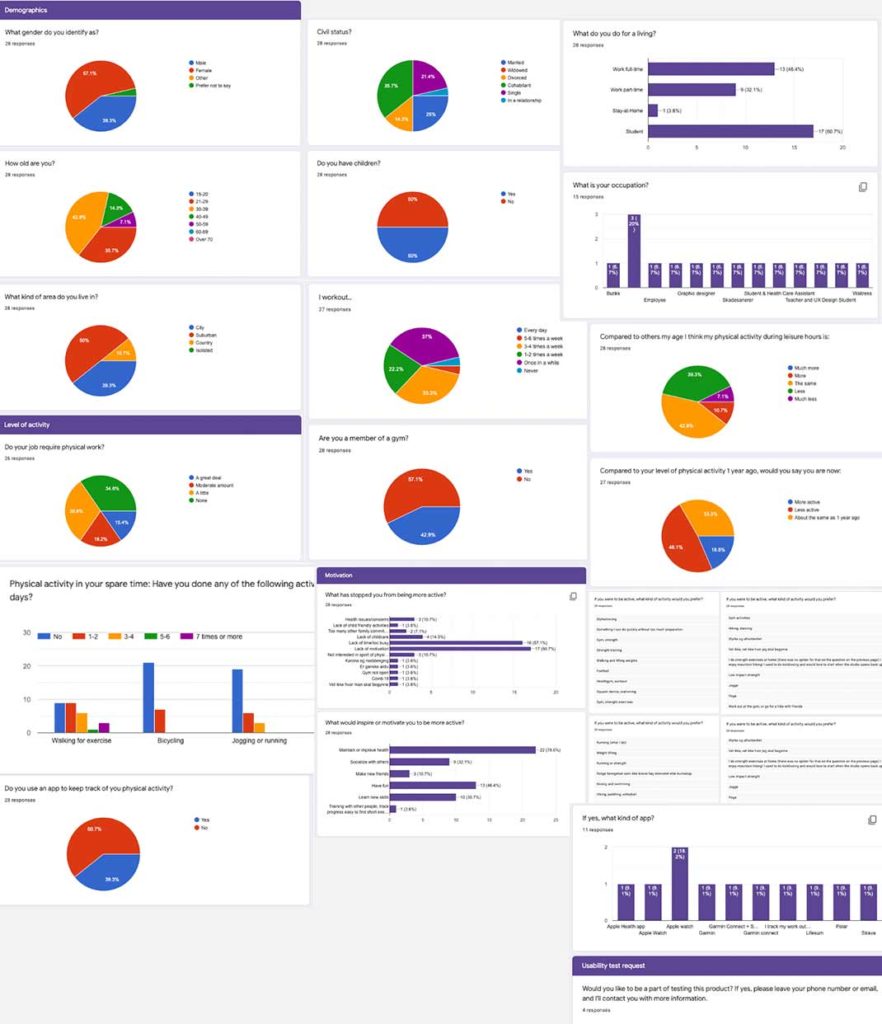
I conducted a survey that got 29 responses most of whom were between 30-39 years old, have a family (partner or kids) work full-time and are only active once in a while. I also used this survey as a recruitment tool for the usability test – asking if they would participate.
Secondary research – Competitive Analysis
🔎 The market for fitness- and workout apps is pretty saturated, you can find an app for virtually any kind of training. There are different levels of content, but some of the might be too full of imagery, videos and audio.
🔎 The apps require the user to be very motivated to the exercise or activity plan. They also require the user to very experienced using their smartphones and apps.
🔎 The apps did not have much focus on motivation, but they did have programs for beginner to advanced.
🔎 Most had a free plan, or a trial period – but they all required a subscription to unlock the full potential of the app and all feaures.
🔎 The market is mostly driven by trends. We have a significant increase in the obese population, and many of us spend a lot of time sitting.
🔎 The research into market and competitors show that there is room for an app that focuses on motivation and incentives.
Analysis
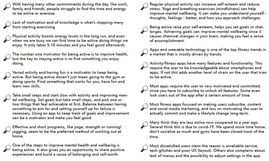
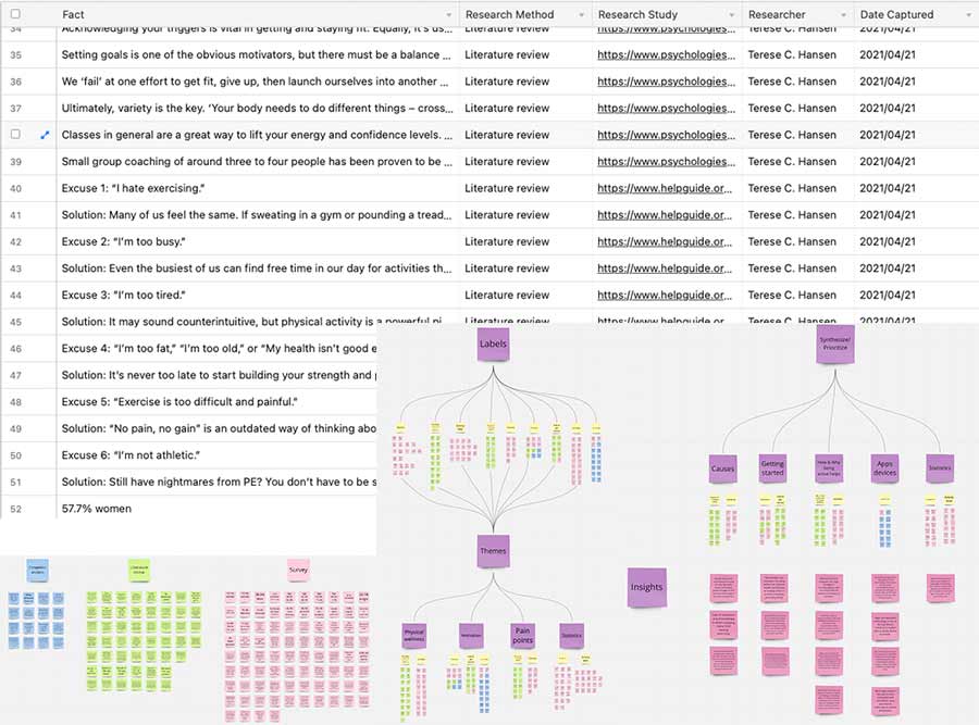
I took the atomic research approach to analyse all the date collected through the survey, literture review and competitive analysis. This method helps with keeping the data logical and manageable. This is especially important when we analyse the material to turn the facts into meaningful insights.
Based on the facts from the Atomic research, I created an affinity map to create the insights.
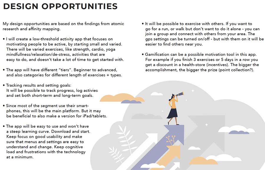
Turning challenges to opportunities
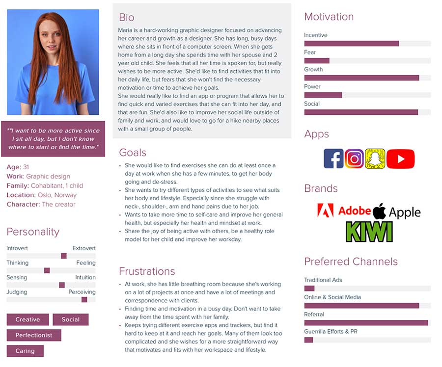
The personas and scenarios are based on the information collected from the survey and literature review – the empathize phase.
I decided to narrow down my focus to norwegian working adults (30-39), because this was the segment that stood out the most in the survey and research phase. Most of them also had a “static” job, with little physical activity during their workday. The majority had a office job, and family responsibilities (spouse and children), and stated that they felt they had little time and motivation to be active or do physical exercise. Most of them also thought that their activity level was less than, or the same as others their age, but that they also felt that they were less active now compared to a year ago and blames covid-19.
Meet the primary persona – Maria
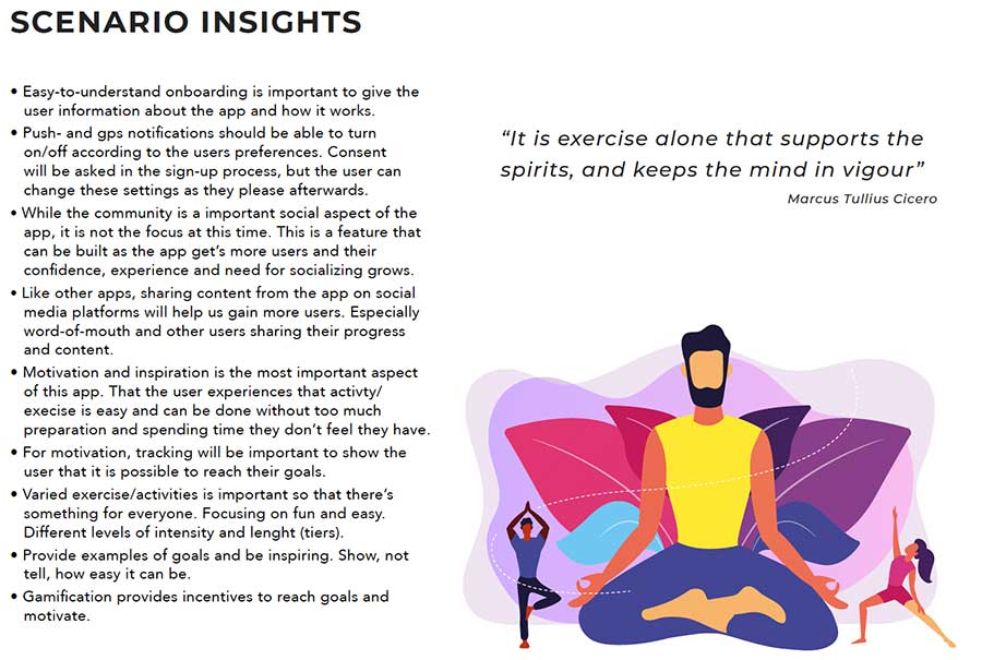
Marias Contextual Scenario
Maria wakes up at 5.30 to start her busy day. She runs around trying get both herself and her family ready for work and daycare. They try to eat breakfast together, but with an active 2-year old they eat on the go.
After dropping her child off at day-care she arrives at work heads straight to her desk ready for another busy day with looming deadlines.
Concentrating and sitting in the same position for hours can be hard on the body, leading to muscle straing and tension headaches, and she tries to take 5 minute breaks regularly. But imersed in projects it’s easy to forget – and before she knows it it’s lunchtime.
At lunch, she and her colleagues talk about anything and everything, when one of them mentiones that she’s gotten so much better in her arm after she downloade a app that had 5 minute stretching and breathing exercises she could do at her desk. Intrigued, Maria asks more about the app and discover that it has all kinds of activities for busy people and that it is quite motivating. She asks for the name of the app and downloads it immediately.
Back at her desk she is soon immersed once again in her work,when she feels tension in her neck. She remembers the app, opens it and creates an account. She browse through the content and see that it doesn’t only have stretching and destress exercises – but all kinds that you can do to get in shape. She also notices that there are several levels from short programs with lower intensity, to longer with higher intensity.
She also sees that she can set short-term goals in addition to long-term goals.
She find an exercise for stretching tight neck and shoulder muscles that she can do in her chair and only lasts about 5 minutes. She starts the program and do the exercise. She notices immediately afterwards that she is calmer, and that her neck, shoulders and arms hurts a lot less. Happy, she gets back to work.
After work she rushes to the day-care to pick her son up before it closes, and then heads home. The hours fly wit h making dinner, keeping her toddler active while also trying to talk to her spouse. After her son’s bedtime she is tired and sit on the couch just messing around on her phone. She remembers the app, and opens it. She looks at t he short activity programs and find one that combines yoga with breathing exercises and only lasts about 10 minutes. And it’s something she can do without preparing. She decides to try it out, and get’s down on the floor.
After a month of trying different exercises in the app, she finds that she is more active, she has found activities that suits her after trying several and has even set a goal for herself. She also discovered the groups for people to do stuff together, and has plans to joing 3 people from her part of the town to go on a hike. She is really surprised and happy about the whole experience.
Problem definition
From the insights so far, I created “How might we” questions to help with
the creative process and develop the design opportunities.
- How might we motivate and inspire office workers to become more active at work and exercise in their daily life?
- How might we show them that they don’t have to have a lot of time to be active, that they can do short bursts of something fun or easy, and it will still be effective?
- How might we create a solution that makes it easy for people to set goals and reach them?
- How might we create a solution that offers different activities, with different length and intensity?
The 4 W’s
🏆 What is the problem?
People are less active. Especially office workers spend hours sitting down in front of a computer. This can lead to physical and mental stress, and make people less motivated. It also often leads to strain injuries and/or dexterity issues.
🏆 Who experiences the problem?
Everyone can experience trouble with finding motivation and time for physical activity. But it is a bigger problem for the adult working population, and especially those with desk-jobs. They spend long working hours sitting down and this might make them unmotivated and feel that they have little time for exercise.
🏆 Where does this problem occur?
It occurs in our daily live, at the office. And it then often transfers into our private life. We struggle to find time and motivation between all our responsibilities and it’s much easier to make excuses.
🏆 Why does it matter?
It has a strong impact on our physical and mental health. Being active can prevent strain injuries, improve our overall mood and daily quality of life. It can also give more confidence and make us better at handling stress.
Problem definition
“Office workers spend most of their days sitting in an office and this has started to affect their health. They struggle with motivation, and uses lack of time and not knowing where to start as excuses. If I can solve this problem, it would improve office workers’ overall health and motivation, and prevent them from consequences like losing work because of muscle strains and dexterity issues. This would also benefit t he company because of the positive effect promoting health can have on the brand, and open up possibilites to collaborate further with other businesses.”
Vision statement
“My solution will help office-workers become more active by being inspiring, motivating and providing incentives and tools to show the user how to start being active and reach their goals. This will ultimately allow people to find something that works for them, and have fun while their increased levels of activity also better their overall health.”
Accessibility and WCAG 2.1
My work on accessibility and WCAG 2.1 can be viewed by clicking the link.
To start making sense of all the data collected and defined it isnow time to organise the date into logical patterns or groups. In the ideate stage the point is to think creatively and generate as manye ideas as possible. This process also allows me to think outside the box and think of more solutions to the problem.
Brainstorming and Moodboard
To generate as many ideas as possible and fast, I chose brainstorming. I used the previous HMW-questions and problem statement as my main focus, and generated as many ideas as I could surrounding them.
The solution to the problem is thought to be an app (scenario insights). And this session will either validate the idea, or it will show me another better solution. In addition this branstorm will also help set the requirements for the solution.
To engage my visual senses as well, I created a moodboard to help me keep focuses and for further inspiration.
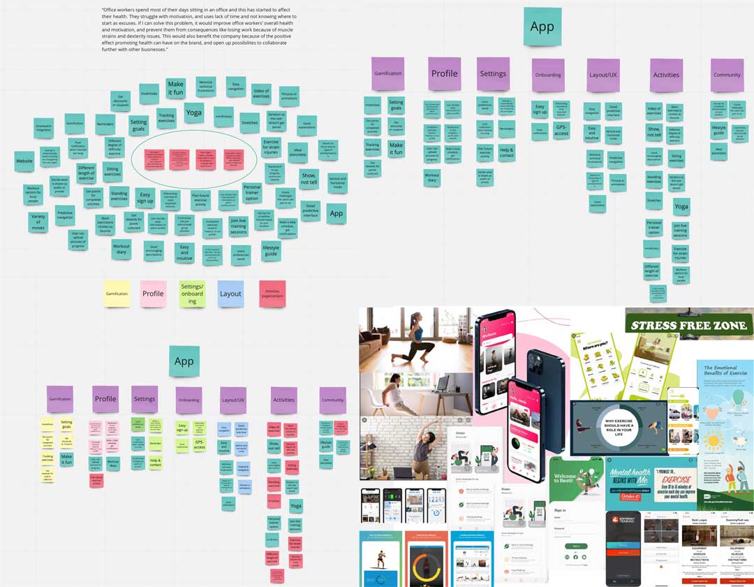
I found various solutions and features to my scenarios and problem statement, and started creating the requirements, information architecture and user flows.
Requirements..
.. is the process that explains what the product is, and what it should do. The requirements are based on personas, the scenarios, problem- and vision statement and the ideation process so far. And to make sure that the requirements fit the product, they were also based on my HMW-questions.
🛠 Motivation to be more active. The app is geared towards busy people (office workers) and is tailored to the environment you’re in. The aim is to get people started, and show them that they don’t have to have alot of time in order to be active. Diversity in type of activities.
🛠 Set goals and track progress, get rewards for point collection or reaching goals. Rewards in the form of discounts, coupons etc.
🛠 Activities can be marked as favorite and easily found again (added to list). Activities can also be scheduled in a calender and the user will receive reminders if they choose that option. There is also a possibility to log progress and add notes to the calendar.
Information architecture
To improve usability, this is the system that is used to organise and label information. The IA shows how the information in an app or on a website is organised and structured.
To make sure that the navigation was user friendly, easy to understand and predictable, a card sorting session was also conducted.
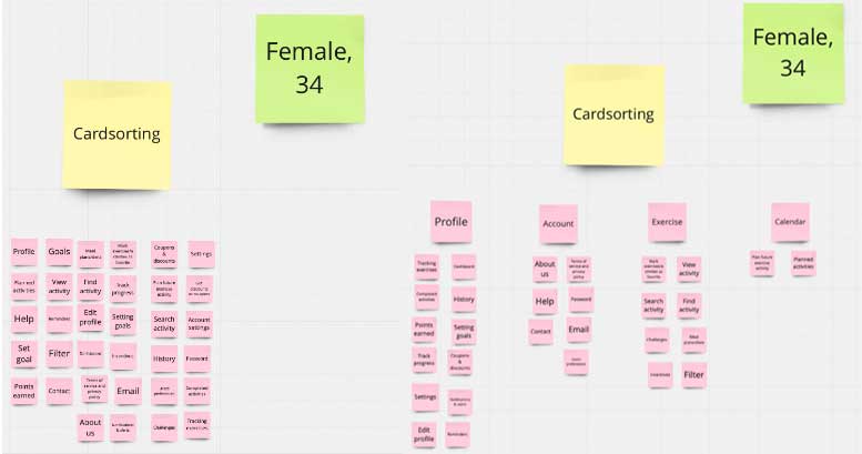
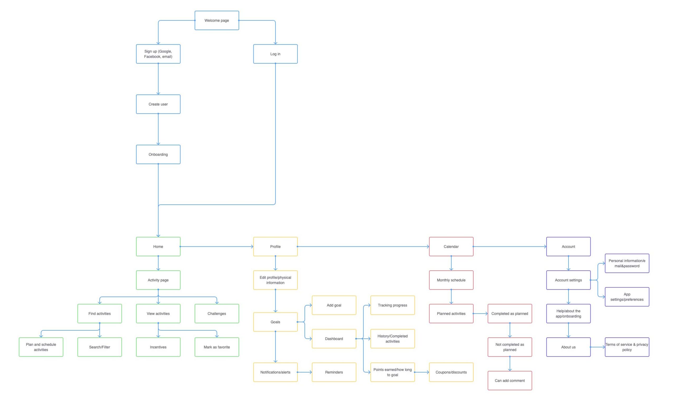
User Flows
These are based on the persona’s needs and goals, and how to get there in as few steps as possble. Considering her needs, frustrations and goals, this is how she might want to experience the product:
- Register user
- Browse and chose activity to do
- Add activity to schedule
- Add goal
- See progress, track goals and how long to reward
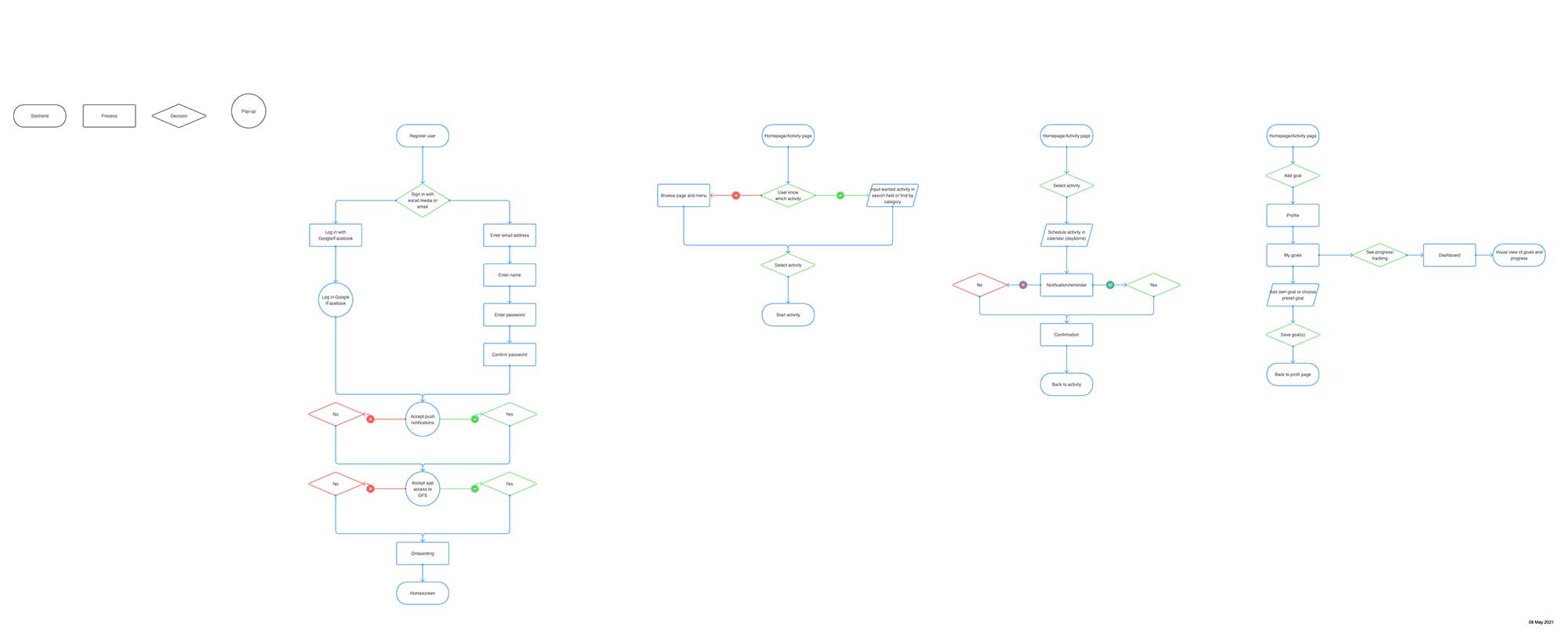
Task Flows
Are a single flow that represent a task that is completed similarly by all users for a specific action. It tends to be linear, doesn’t branch ou and illustrates the main steps the user will take to reach a goal or complete a task.
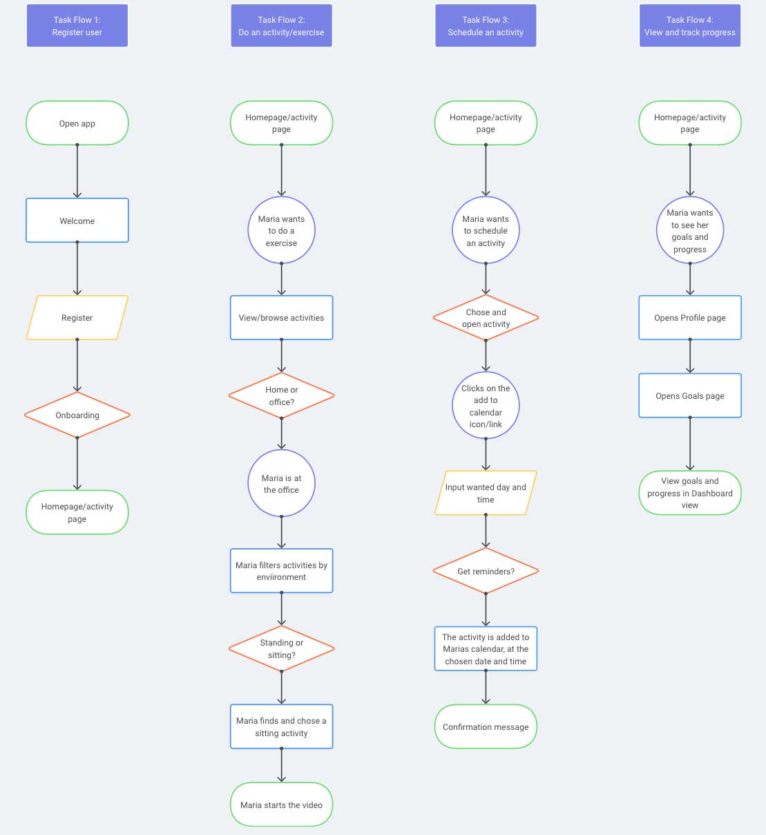

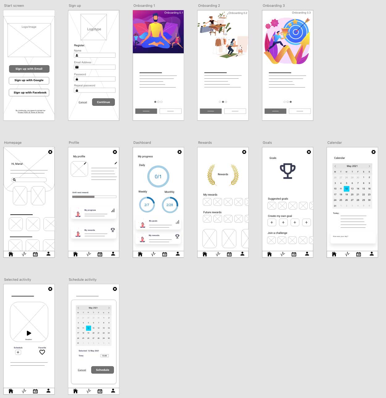
During the prototype phase, I made low-, mid-, and high fidelity wireframes. This was done to come up with the best solution. In this process the Three Levels of Design was considered, to make absolutely sure that the app meets the users’ wants, needs and goals.
To get the best start on the wireframing I also created a moodboard, and sketched out some ideas. This resulted in the beginnings of a Design System. A Design System makes it much easier to keep consistency throughout the process. It’s also good for reusing and standardizing the design.
Mid-Fidelity Wireframes
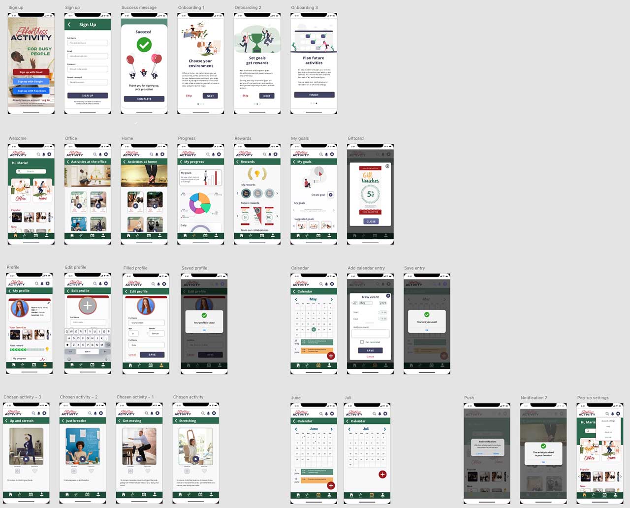
The mid fidelity wireframes were used for the usability testing. High Fidelity was created after the test-phase.
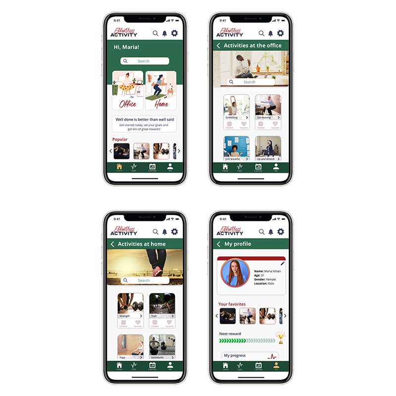
High-Fidelity wireframes
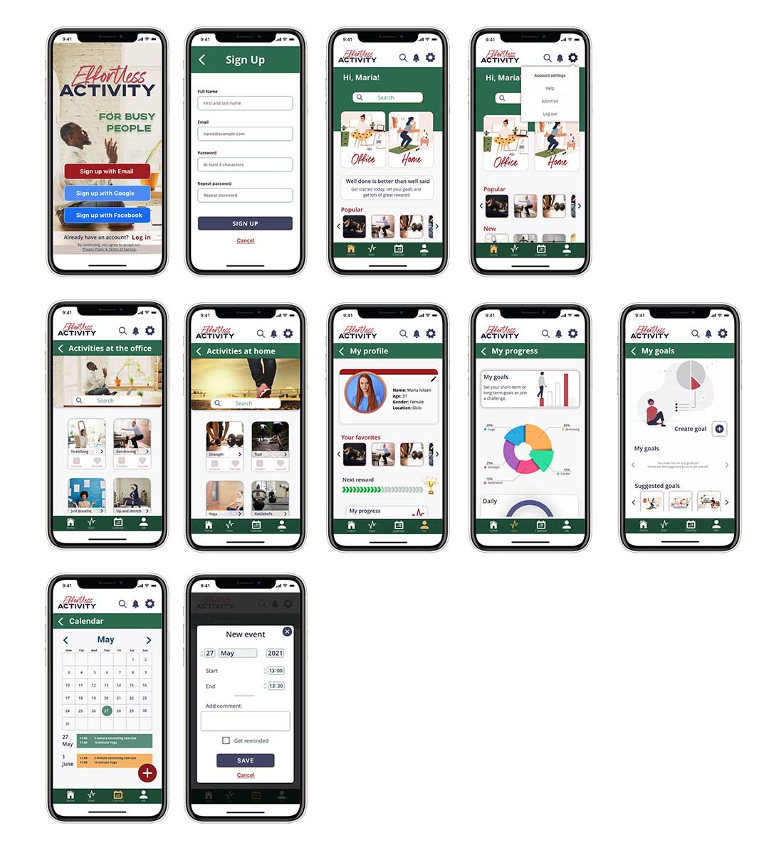
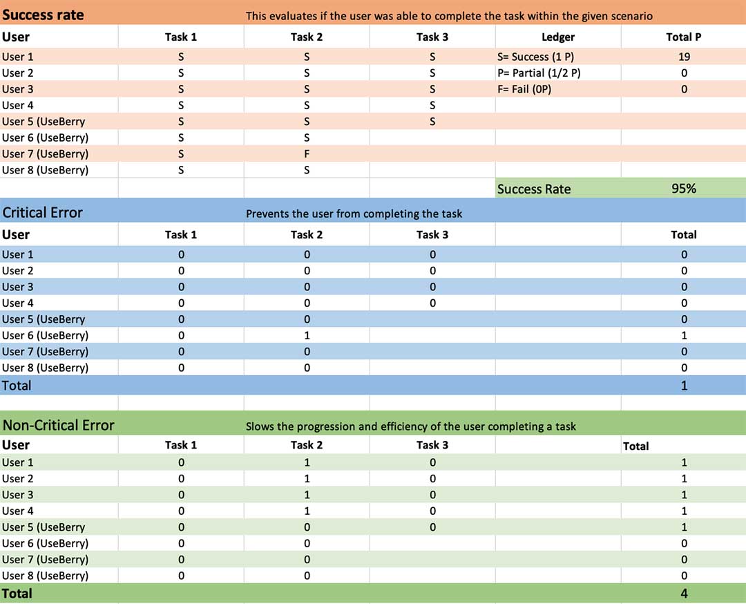
The main purpose of testing this prototype was to see if the user can accomplish the tasks presented and how. Does it meet expectations? Do they encounter any usability issues and how can we create a better user experience?
A unmoderated and remote approach was chose for this first usability test of the prototype. It was conducted without a facilitator, and they could test in their own environment.
The participants were encouraged to think aloud (CTA), while completing the tasks. This was to see if there was any correlation between what they said vs. what they did. They also were asked to answer some questions before and after the test.
The mid fidelity wireframes were the prototype used in this test. Test them here.
Analyzing and Synthesizing
I used the atomic approach here as well, and an affinity map.
To summarize the results:
“Would try this at work”
Participant 4
✅ The layout and user- and task flow seemed to match the users mental model. It also appeared that it matched their expectations and they navigated the app without trouble.
❌ Some of the icons were too small, and led to poor visibility. In addition they were hard to interact with leading to poor usability as well. The app should be improved in regards to icons and buttons. Should also ensure that they all work.
❌ Not all icons worked when the user tried them, and should be fixed.
✅ The users’ liked the colors and layout of the app, and thought it was clear what the app was about.
✅ Most of the users’ thought the app was a good idea, and would at least try it. Especially since it focused on busy people and the work environment.
❌ The activity cards should be re-designed. The play-button is confusing. Mismatch between design and the users’ mental model in regards to the links/cards. They don’t behave the way the user expect.
✅ The app was tested by persons that fit the demographics, and seemed to have hit the target group in terms of layout and colors.
❌ Emphasize the benefits and incentives in the app more.
Iterated Wireframes > High-Fidelity
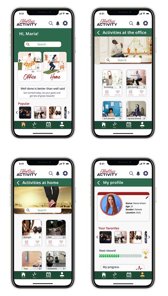
The insights gained from the usability testing formed the basis for this iteration on the wireframes.
Test the iterated high-fidelity wireframes.
The main changes made in the wireframes:
- The icons were made bigger and more visible, and increased spacing between them.
- Made sure that everything worked and was linked correctly.
- Added a search bar to the “office” and “home” page for better access. It’s easier to reach with thumb, and I expect this feature to be most used on the main activity pages.
- Changed some imagry/iconography and made it more visible.
- Tried to emphasize the incentives by adding text to the main page.
Conclusion
After completing the design process for now, I have created an app that should help busy people start getting active. Most of the challenges I faced during this process occurred in the usability testing. Some of the participants did not complete the test, or changed their mind. And I also faced some technical challenges with the platforms I used for the testing. Some recordings and information was not saved, and the test stopped functioning half-way through.
What I learned ..
The biggest lesson I learned from this is to always have a plan B, C, D and E for usability testing. Because something will always go wrong. The other thing is to continue being open to changes and not get too attached to the idea and product. The other thing I take from this is to keep the focus on each step of the Design Thinking process, to not jump ahead or form opinions or conclusions ahead of time. And keep in mind always that Design Thinking is iterative, and if something does not work – it’s seldom the user’s fault and most often it’s the idea or the product that needs more work.
What’s next?
- Testing and more testing. To gain more insight a moderated session should be conducted. The previous testing did not yield enough insight into the users goals.
- Test the high-fidelity prototype with the improvements to see if the prior usability issues are solved.
- The app needs more emphasis on purpose and incentives.
- Images needs to be more unified across the app.
To see the whole report on this project, just follow the link to the .pdf-file.
Thank you for reading all the way to the end!
