Design Foundations: TreeLife
The Brief
TreeLife knows that many people care about nature, want to protect the environment and fight climate change –especially its eco-conscious customers. TreeLife recognises the importance of tree planting as a natural climate solution but doesn’t necessarily have the knowledge or space to plant trees themselves.
The Objective
Design a four-page website for TreeLife’s initiative to educate people about planting trees.
The audience
-
50% male and 50% female
-
aged between 25 and 35
-
people who like spending time outside
-
people who value nature and their surroundings
-
people who strive to lead a more sustainable life.
Timeline
September 2021
Team
Terese Hansen
My role
UI Designer, researcher
Project
Course Assignment Noroff
Tools
Adobe XD
Photoshop
Illustrator
Airtable
Xtensio
Miro
Methodology
The Design Thinking approach was used to gain an empathic understanding of the people
we are designing for, and for the problem we are trying to solve.

Reflect & Research
After reading the brief and other information several times as well as studied the problem statement – I started gathering my own information and thinking about the problem. One of the things I did was search for similar companies and brands that sell clothes or other items to reforest or rewild. I also searched for foundations that don’t necessarily sell stuff but is based on contributions (charity) for more information about the problem itself. Foundations are a good source for more quantitative data about reforestation. They often refer to research and studies done on the cause and effect of deforestation and planting trees around the world. Lastly, I tried to read more about sustainable living, to get a better understanding of what it means in practice.
While gathering more information (informal literature review) about the subject I also looked at the design and layout of the websites. I noticed that many of them use much of the same color-palette and much of the same layout. They also have a very similar tone of voice. My impression is also that a few of them have some usability issues in terms of too much informat ion, placed illogically and with little contrast. Many of the sites not written in English also struggle with the English translation, where some text is in English and other parts in French for instance.

Defining the idea
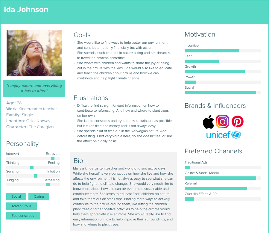
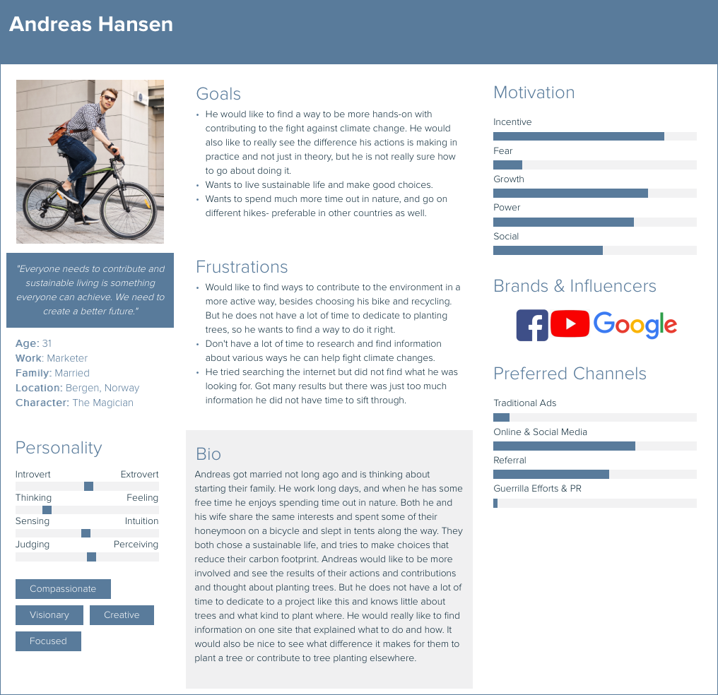
To really have a clear vision of t he target users, I created a persona profile to keep them firmly in mind and to better understand and feel empathy for the users. I made one female and one male based on t he information about the target users provided. Usually, a lot more work goes into making these – something I did not have time for on this assignment.
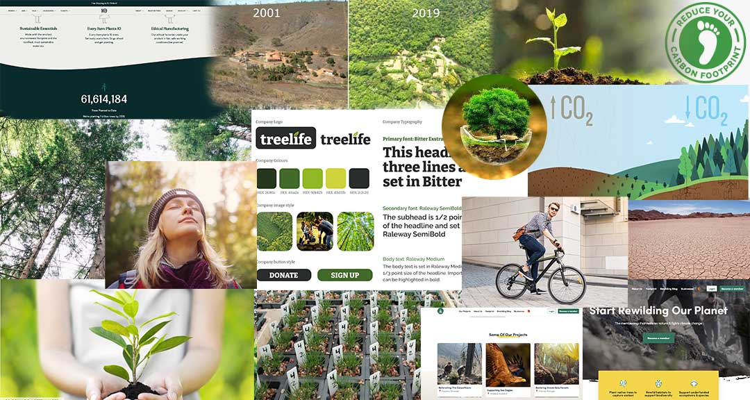
I also created a moodboard of sorts to keep my inspirat ion going while working on this. It helps me to stay focused on the direction I want to move in, and t he mood and message I want to express.
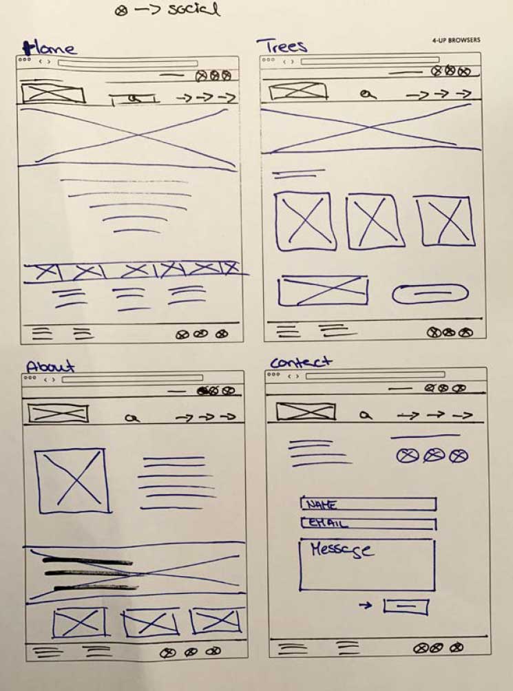
After research and defining the idea, I started to work on t he low-fidelity wireframes (sketches), and the goal was to make the pages tell a story.
Meet the personas:
Ideate & Low-Fidelity wireframes
TreeLife adresses a serious problem; We are in a critical climate crisis but I still wanted the visitor to get a positive and hopeful vibe when visiting. Because we can still do something, it’s not too late.
I also wanted the page to be organic, simple, informative and elegant, in order to get the visitor interested, learn about the project – and most of all to get them to plant a tree or to donate.
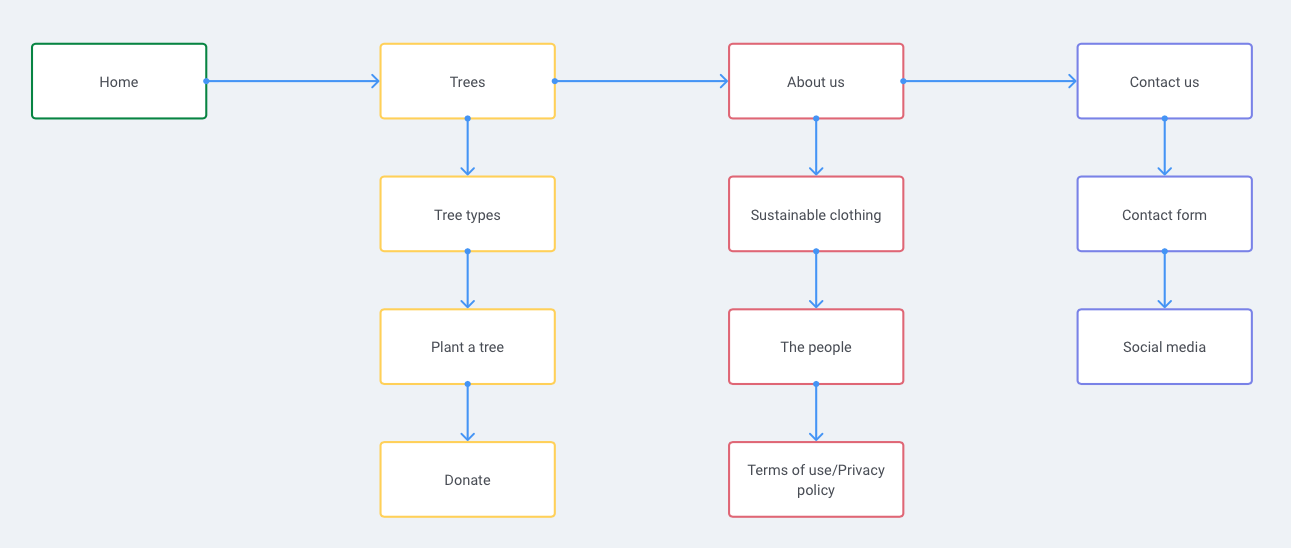
In order to visualize the build and hierarchy of the pages I made a very simple IA (in – formation architecture/UserFlow) and I also tried my hand at some low-fidelity, rough sketches.
High-Fidelity Wireframes
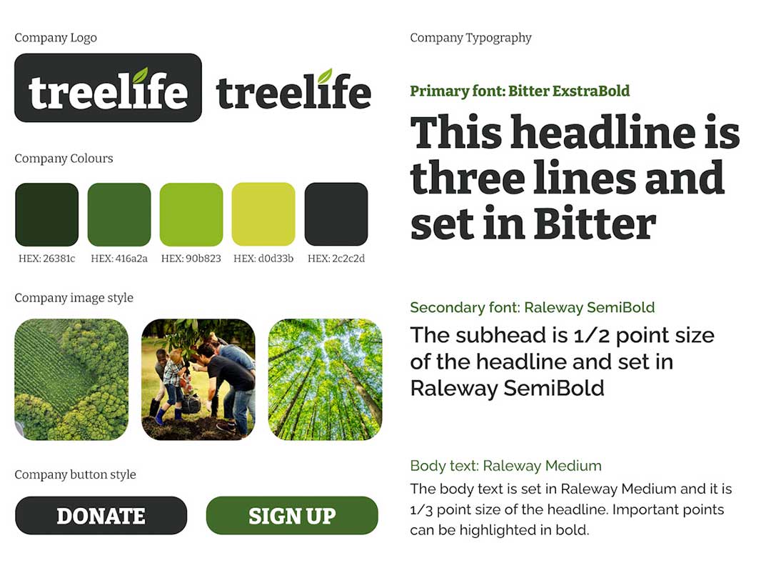
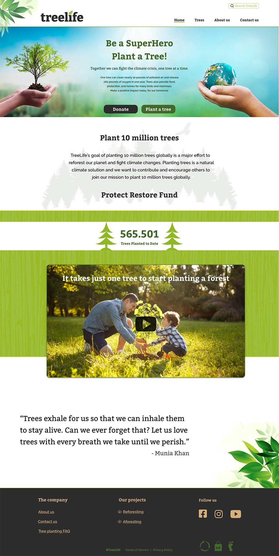
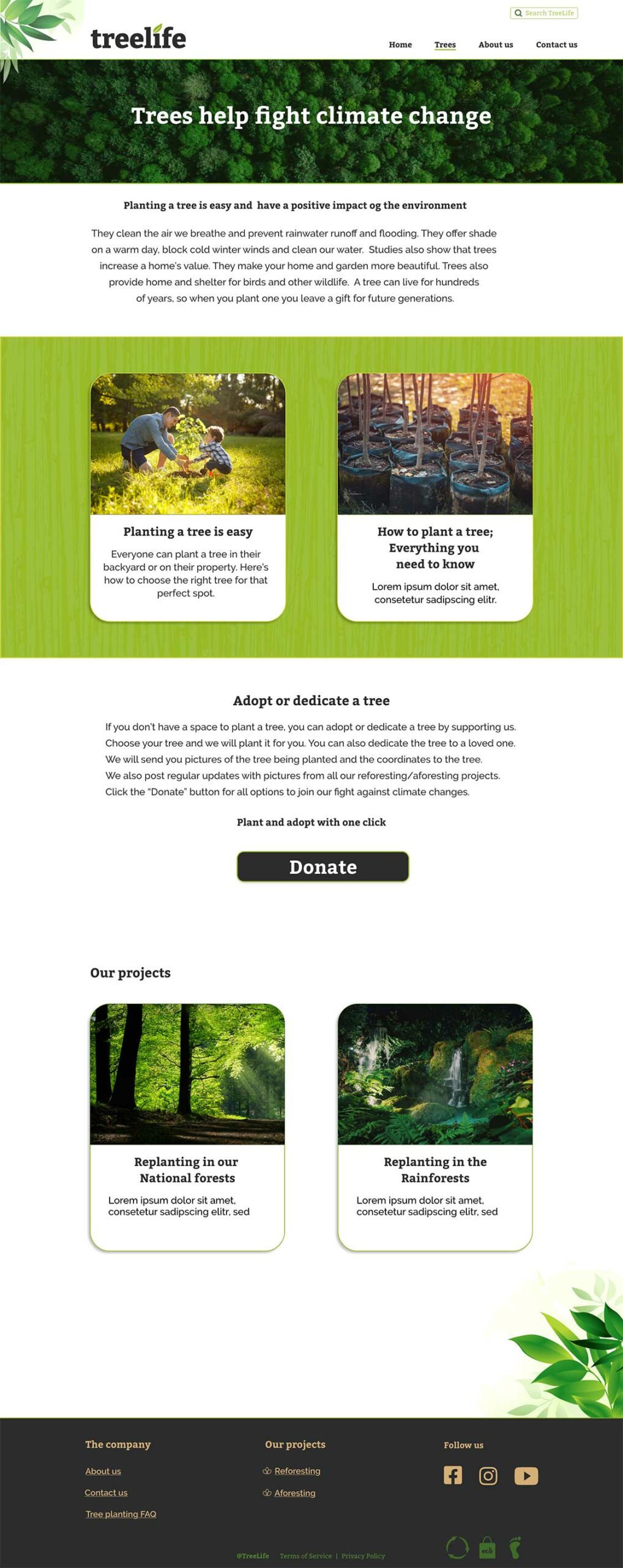
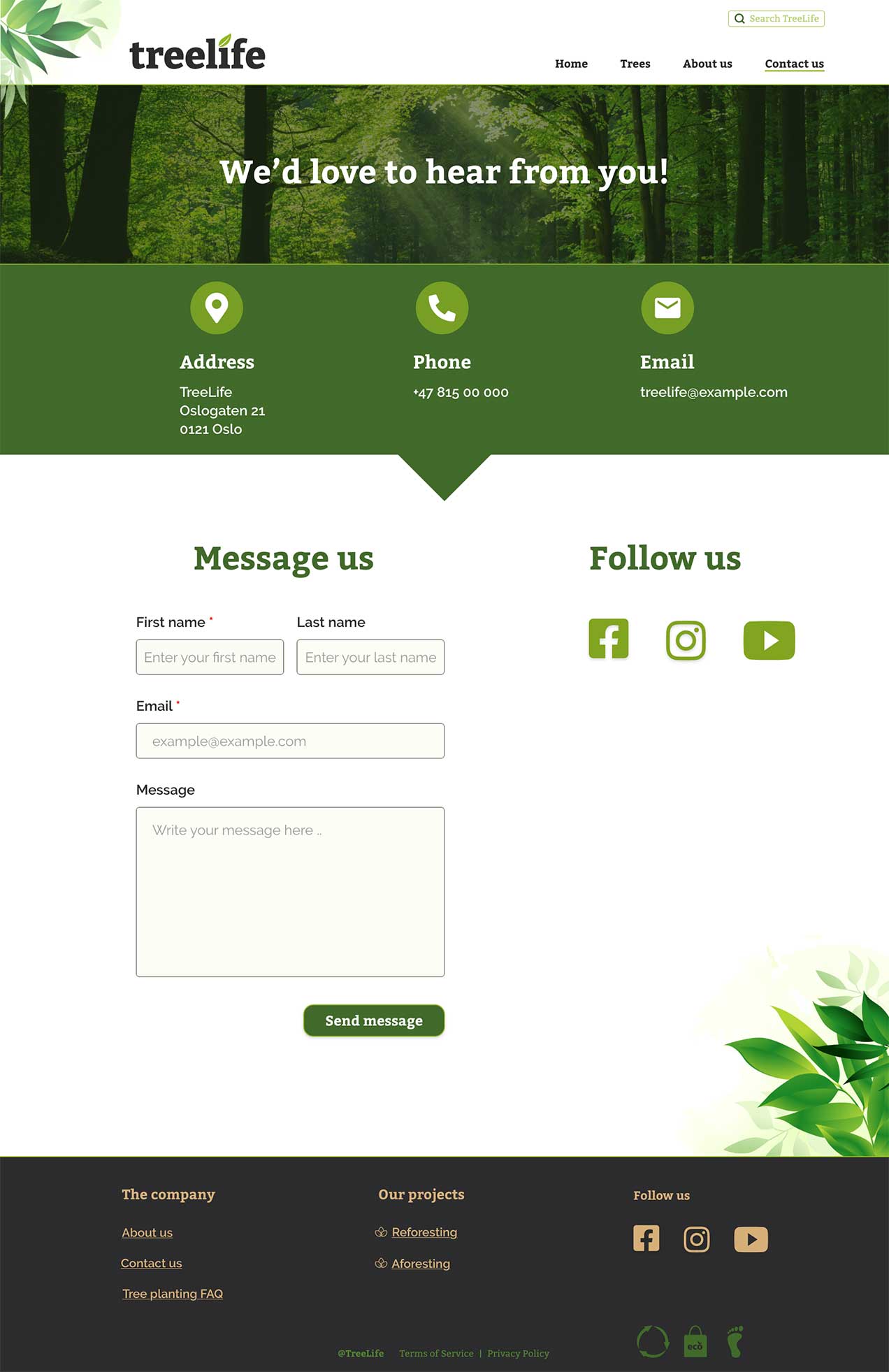
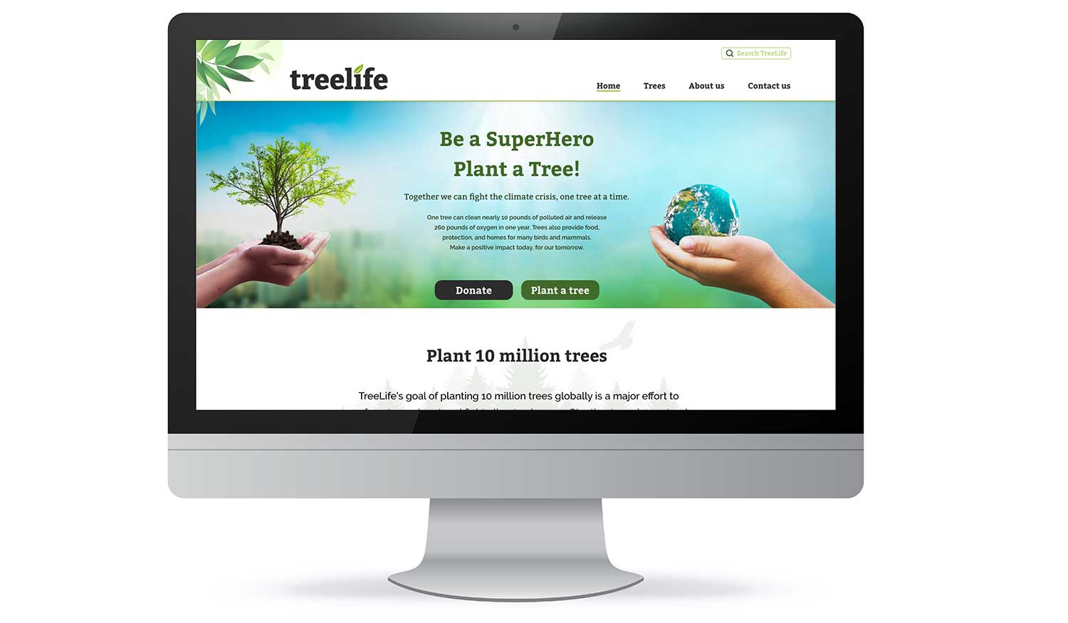
The page is mostly a three grid layout. All the important information is placed inside these three columns, and the layout is consistent and predictable. The colors and fonts are in acordance to the company graphic profile. Colors are used sparingly, mostly to emphasize or as an accent. The images fol low the tone of the company, and are used as navigation, to illustrate and tell a story. I’ve tried to focus on usability and visibility. I’ve made sure that the whitespace gives the users time to breathe, to separate different content and to create a logical flow in the design.
Some changes were made from the low-fidelity wireframes to the finished design, but the basic structure and idea is the same.
The High-Fidelity Wireframes
Conclusion
I tried to tell a story with the use of pictures, text, colors and consistent layout. I’ve tried to follow conventions, design rules/principles and also wcag 2.1 (accessibility/usability. While the design is finished for now, I do think that the pages need testing to find out if the text and navigation needs more work.
But overall I think that this design will engage the users and take them on a journey.
What’s next?
The next step would be to test the wireframes/prototype and then iterate until it is ready for launch.
Click the link to see the live wireframes.
Thank you for reading!
